I led the ideation, strategy and design for the web platform.
8 weeks
Research
User Flows
Information Architecture
Sketching
Wireframing
Branding
Content Strategy
Interface Design
Prototyping

Duration: 8 weeks
Imagine you find an image for future reference. How do you save it? Do you create a google doc with numerous links? You cannot preview them, so when you try to access it- it’s just a sea of links! How frustrating. Sure, you can use Evernote, or Dropbox Paper, or Pinterest. But what if you need to add notes move images around, compare them, change sizes, put text on it?
Currently, users need multiple applications to accomplish these tasks.
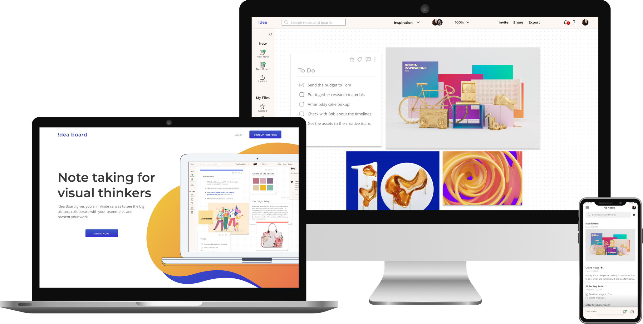
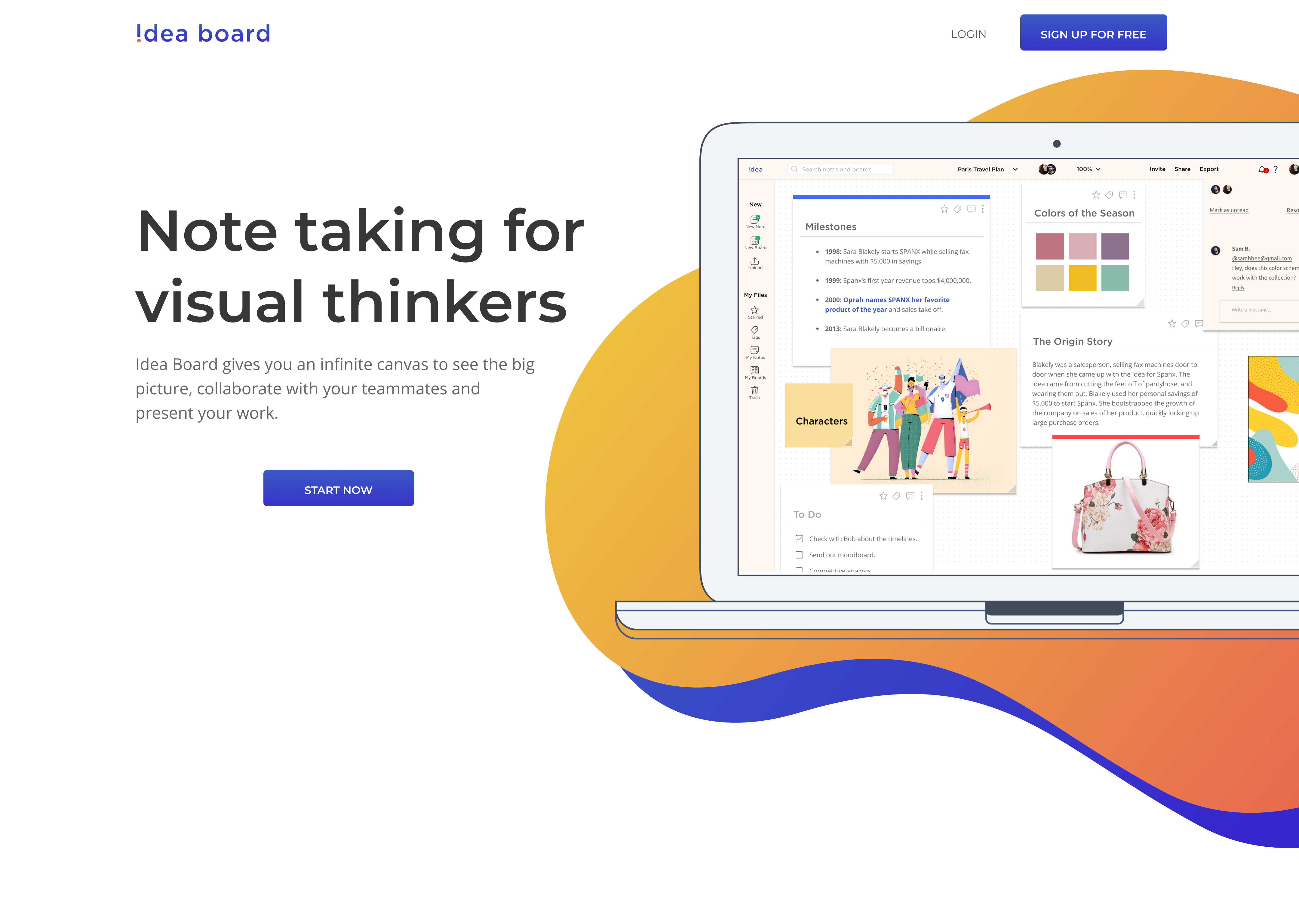
Idea Board is a one-stop solution for all those needs.
Through comprehensive user research, competitive analysis, and user testing, I created Idea Board — a note-taking application that helps you see the big picture and connect the dots. It gives you an infinite canvas and lets you create a note, move it around, and even put it on top of each other.
Idea Board works the way you think.

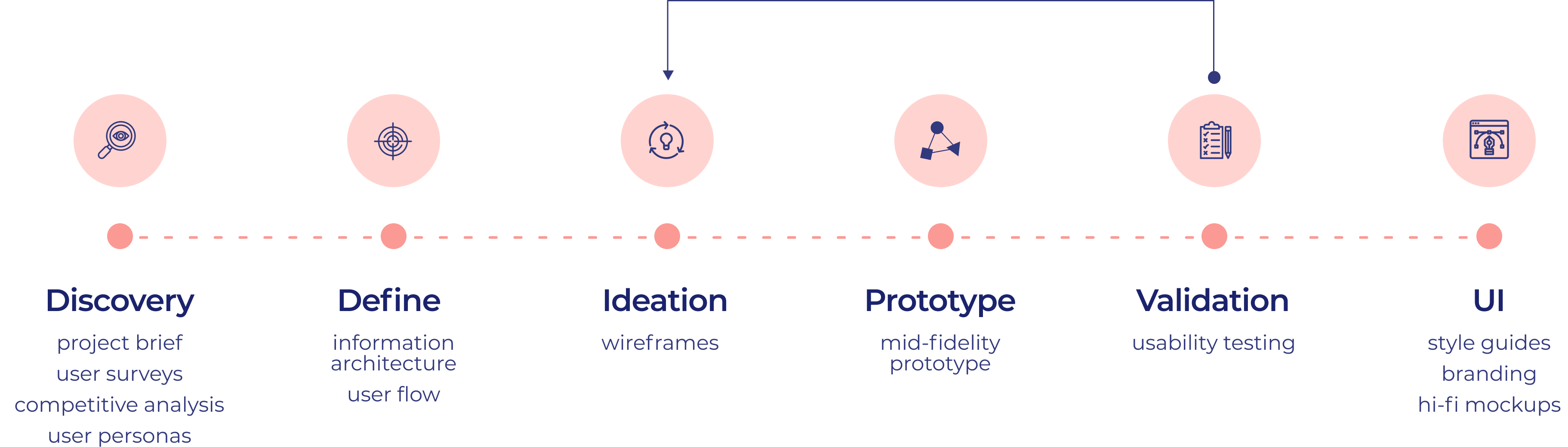
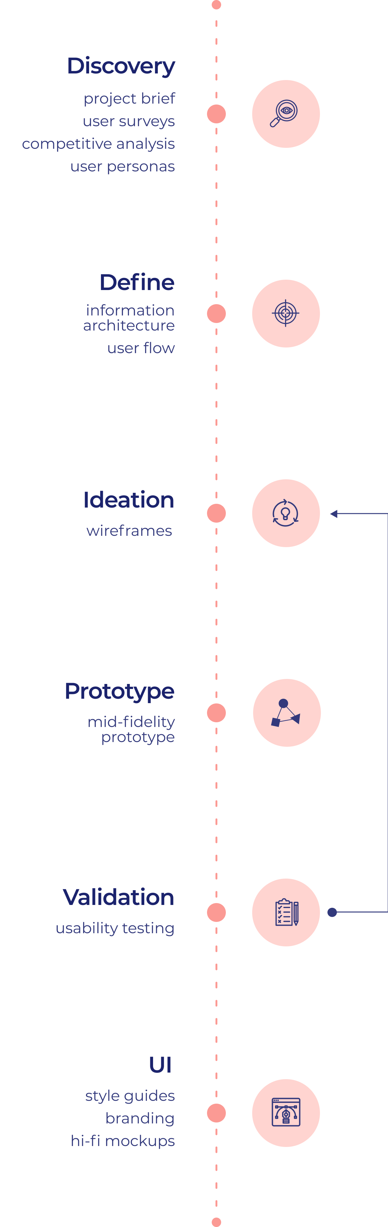
The first step of the design process involved understanding the requirements and how competitors positioned themselves. The path to Idea Board consisted of detailed and careful user research, competitive analysis, user personas, user stories/flows, wireframes, mockups, branding, prototypes, and user testing – all with various iterations.

The stakeholders had mentioned several possible features, including creating content in various formats, saving inspirations found online, organizing both, sharing documents, collaborating with teammates as well as social sharing. But they leaned on me to help them figure out a clear vision, and narrow down the opportunity and niche market.
When we think about Cloud Storage, some big names immediately come to mind, including Google, Dropbox, Evernote, and Microsoft. There are plenty of ways we can go about it, so how do we narrow the focus?
To find the under-served market, I first had to figure out HOW people use their current cloud service. I wanted to learn about why they create documents, how they collaborate, what methods do the users adopt to save and organize their files, and how they access them later.
I deployed a user survey to gather data to look for patterns, trends, and outliers. I conducted phone and in-person interviews. 22 participants took the online survey.

Use a laptop to create documents and mobile to access it. Google Docs was the most popular application, followed by Dropbox and Onedrive.

Save web links and take rough notes on a cloud platform, like google docs and opt to create a final presentation on another application.

Find it hard to keep reference images and videos from the web - and even harder to remember what was saved as it lacks previews.
The user survey clarified many questions I had in regards to the target market. Based on the results of the survey, I came up with two personas that we’ll be designing this product for.


41, Chicago, IL
Digital Marketing Director at a fortune 500 company
41, Chicago, IL
Digital Marketing Director at a fortune 500 company
To save and manage a list of articles, images, and videos from the internet.
Marc lives in a suburban neighborhood in Chicago, IL. He’s a father of three, and a digital marketing director at a mid-sized company. He uses Google Drive and dropbox paper but wishes that there was a less rigid solution to help visually strategize with his team.
The current app doesn’t provide an excellent way to store articles other than a bunch of links.
The current app doesn’t provide a decent way to track changes or leave comments within images or videos.
“Saving inspiration links without being to preview them is a waste of time.”


24, Los Angeles, CA
Freelance Graphic Designer
24, Los Angeles, CA
Freelance Graphic Designer
To find a better way to create and present moodboards and other visual elements.
Anna lives in Los Angeles, CA, and works as a freelance Graphic Designer and Animator for various clients ranging from small businesses to big corporations. Anna typically uses Dropbox and One drive for media backup and a service like Canva to create moodboards and presentations. The ability to create visual presentations as well as save her files in one location will make her process quite efficient.
The current app doesn’t provide a good way to save media (images/videos) found online visually.
The current app’s document creation is quite basic.
“I have to save and upload the same images and screengrabs to multiple apps to create moodboards and presentations. I wish there was a better way.”


Cloud storage is a crowded market. There are some big-name competitors in the space. To beat them, we first have to know them.
I decided to take a deeper dive into Google Drive, Dropbox, and Evernote to examine the positioning, primary audience(s), and their differentiators. My goal was to figure out why the competition has taken a particular course of action.
Google Drive is broader, so it appeals to a wide market. It has robust features for collaboration and inexpensive storage space.
Mediocre multimedia features.
With project management tools like to-do lists, schedules, comment on images, sync, dropbox has cornered the enterprise market.
Skimpy free version.
Evernote is a popular note-taking application. It has outstanding search functionality. It also has web-clipper and advanced annotating options.
No folder uploads.
There is an underserved market for creative professionals. Visual designers, motion graphics artists, producers, directors, editors, etc. If we create a collaborative cloud, keeping in mind the needs of a specific group, we can provide a lot of value to our niche users.
To brainstorm specific features for the product, I answered How Might We questions using insights from my research through the POV of my user personas.
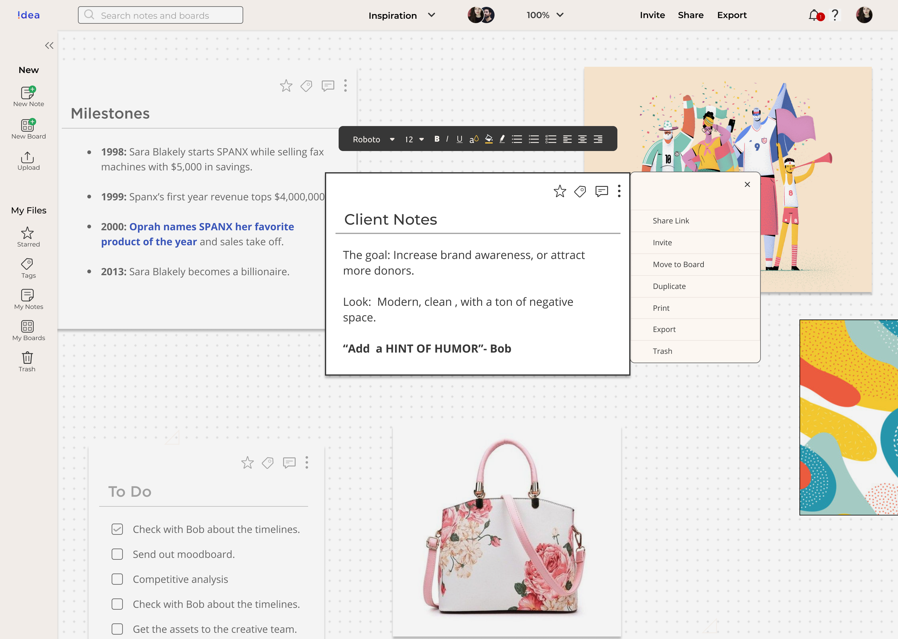
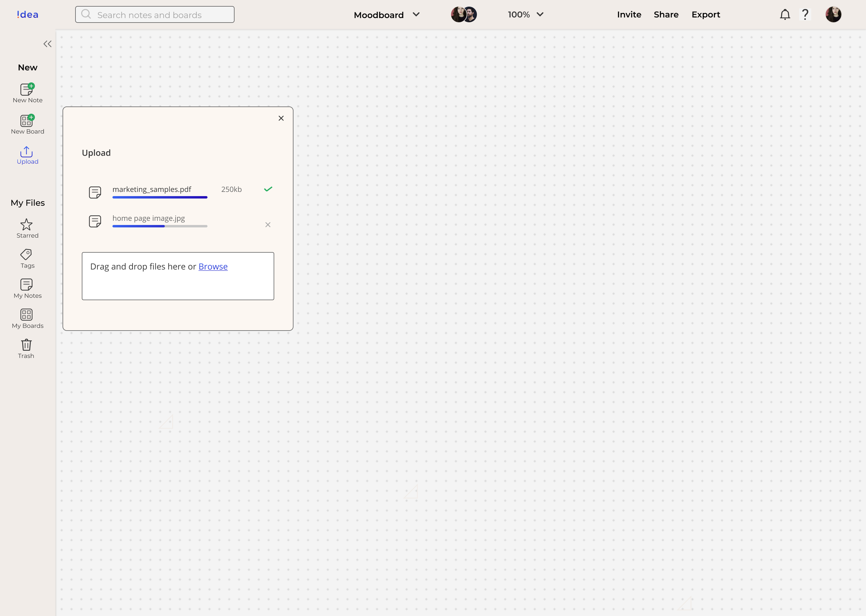
An option to upload images, videos, and text anywhere on the board.
An option to move the notes around and overlap them.
Ability to place links to the images and videos directly to the board — and preview them.
Ability to clip articles.
Preview an excerpt of links he saves directly to the note.
Ability to tag notes, images, and videos.
Filter by tag.
Ability to search notes by the date they were created, the type of media they contain (audio, images, etc.).
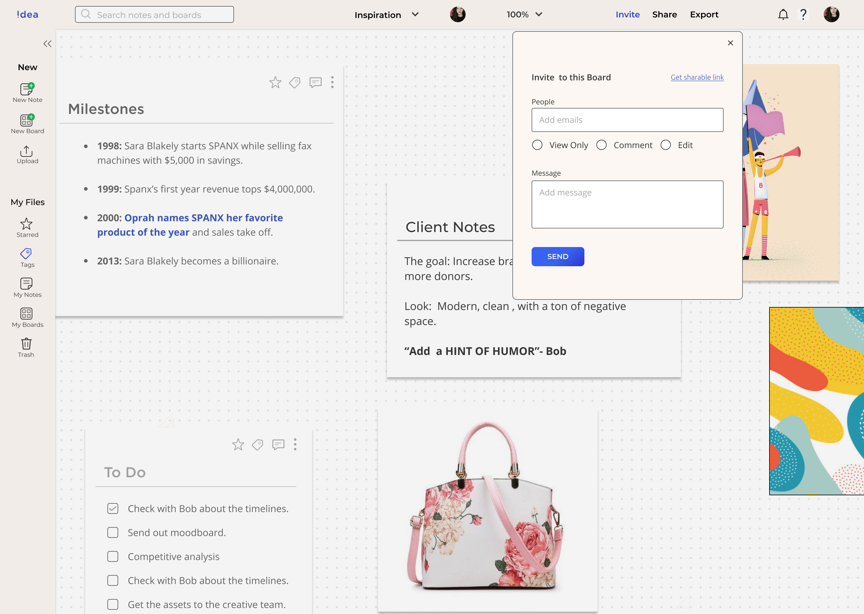
Ability to collaborate and share with the team.
Ability to draw and comment on the photos.
Ability to leave a time-coded note on videos.
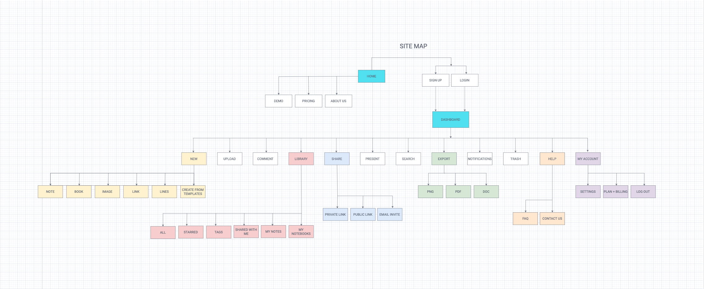
After identifying a solid set of primary features, I mapped out the information architecture to show the hierarchy of major and minor elements. The user-flows and site map laid the foundation for how the application would work.
By now, I had already gathered enough information to get started with the wireframes. I first used pencil and paper to create rough sketches and then created low-fidelity wireframes for all screens that are needed to perform the tasked mapped out in my user stories. This was an iterative process with over three dozen wireframes. Below are a few selected ones.


I performed one in-person and two remote usability tests on my mid-fidelity prototype to see how users would complete specific tasks once they were given some context. The goal was to identify pain points that could be improved in future iterations.
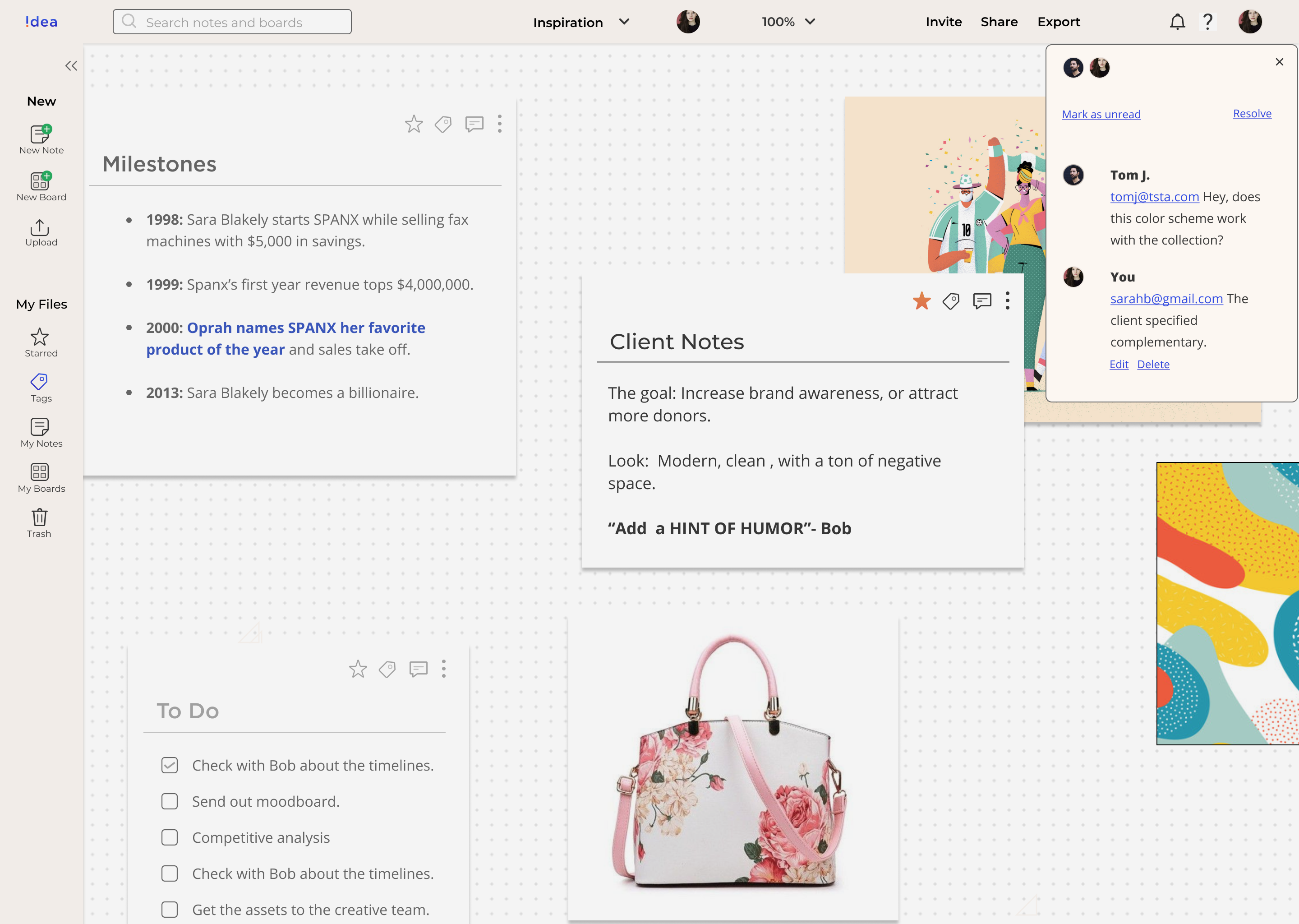
The users were able to perform all major tasks with ease, but a few screens needed further exploration
The users found it hard to star the notes. You can only see the tab menu on the top while you’re active.

The updated version made the tab visible without having to select the note. It becomes functional when the user is active on a particular note.

In the first version, the users could simply drag the files they need to upload on to the canvas. However, some users seemed to be unsure about this feature.

In the updated version, I have included an upload icon on the menu along with the ability to drag and drop to clarify it.

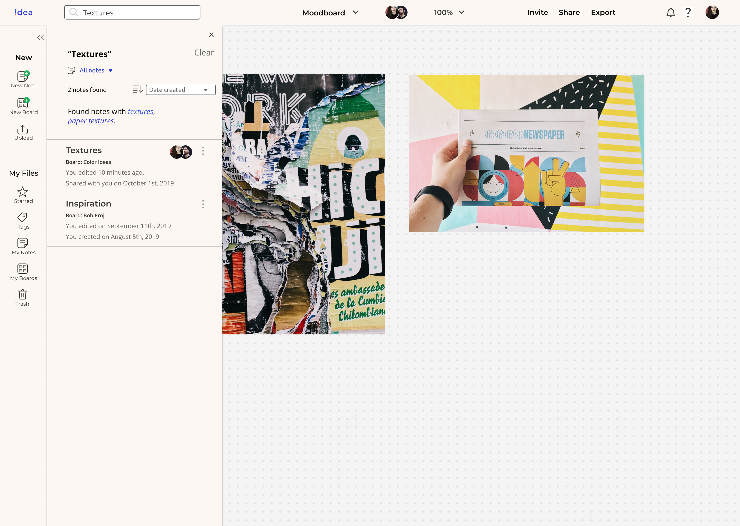
In the first version, the search revealed all results based on the keyword. But this could get confusing as the number of notes and boards grow.

Now search results have context. It tells you if the keyword appears on board, note, title, or body.

Now it was time to add a personality to the product. I used my research as the basis of my branding. It helped me set the context for the product and establish a tone. Idea Board is approachable, artistic, efficient, and stimulating.
The logo has evolved into an upside-down “i.” It represents the exclamation — the joy we feel when we create something, when our scribbles turn into notes, books, pitches, etc.

Blue and Orange are used as primary colors as they represent trust and vibrancy.
I also designed the icons for the interface. I wanted to create a platform that is easy to use, fun, and gets out of its way to let your work shine.
The biggest virtue of a note-taking app is its simplicity. Montserrat and Open Sans are very legible and versatile because of the geometric modesty of the letters.
Now it was time to add a personality to the product. I used my research as the basis of my branding. It helped me set the context for the product and establish a tone. Idea Board is approachable, artistic, efficient, and stimulating.
The logo has evolved into an upside-down “i.” It represents the exclamation — the joy we feel when we create something, when our scribbles turn into notes, books, pitches, etc
Blue and Orange are used as primary colors as they represent trust and vibrancy.
I also designed the icons for the interface. I wanted to create a platform that is easy to use, fun, and gets out of its way to let your work shine.
The biggest virtue of a note-taking app is its simplicity. Montserrat and Open Sans are very legible and versatile because of the geometric modesty of the letters.
Finally, I created a high fidelity prototype and repeated Usability Tests. I also conducted A-B testing for making the final selections.


Another round of usability tests in the books, and I had successfully designed a platform where:
I took a vague concept, defined it based on the data, and created a working prototype.
My background in content has taught me one thing — it’s all about the story — about the hero’s journey. In this case, the hero is our user. So for me, the most important thing was to learn how they do a particular task- what steps they go through- what the obstacles are and how we can make this journey easy for them. Luckily, working in media has also given me several skills like empathy, conducting interviews, analyzing micro-reactions, etc. that directly helped in the creation of this app.
The most important lessons I learned are as follows:
Asking the right questions is harder than finding the correct answers. And often, we don’t know the right questions before we start digging for answers. My experience of producing documentaries helped me tremendously in this case. I was able to strike a rapport with the users. I often got the most useful information in between two questions when the subject would make a casual remark about their process that I got to ask a follow-up question about.
There is indeed a paradox of choice. When we try to offer too many options, it is often more difficult for people to choose one. And that’s why it is so important to figure out the scope and define what is essential. I strived for simplicity in wireframes and aesthetics as well. How can I use one step to do this function instead of two? How do I add more context to it? Am I appropriate feedback within a reasonable time? Are these colors helping them navigate or distracting? How do I minimize the user’s memory load by making objects, actions, and options visible when they need it.
This is true from the User Survey to Interface Design. I found myself thinking a lot about the nitty-gritty. I remember asking questions like, “Do you find yourself exporting .pdfs or .jpgs more often?”, or “Where do you find inspiration,” “What is the amount of time you spend on sites like Pinterest, Dribble, Behance, etc.” “Where do you save notes from your client phone calls.”
Similarly, I used the principles of atomic design and worked on the smallest elements first and then built a design system using the collection of parts.
To work on the macro — we have to understand the micro. That’s how we can make the most significant impact.