Using design principles to create award-winning content.
Overview
Overview
The gist
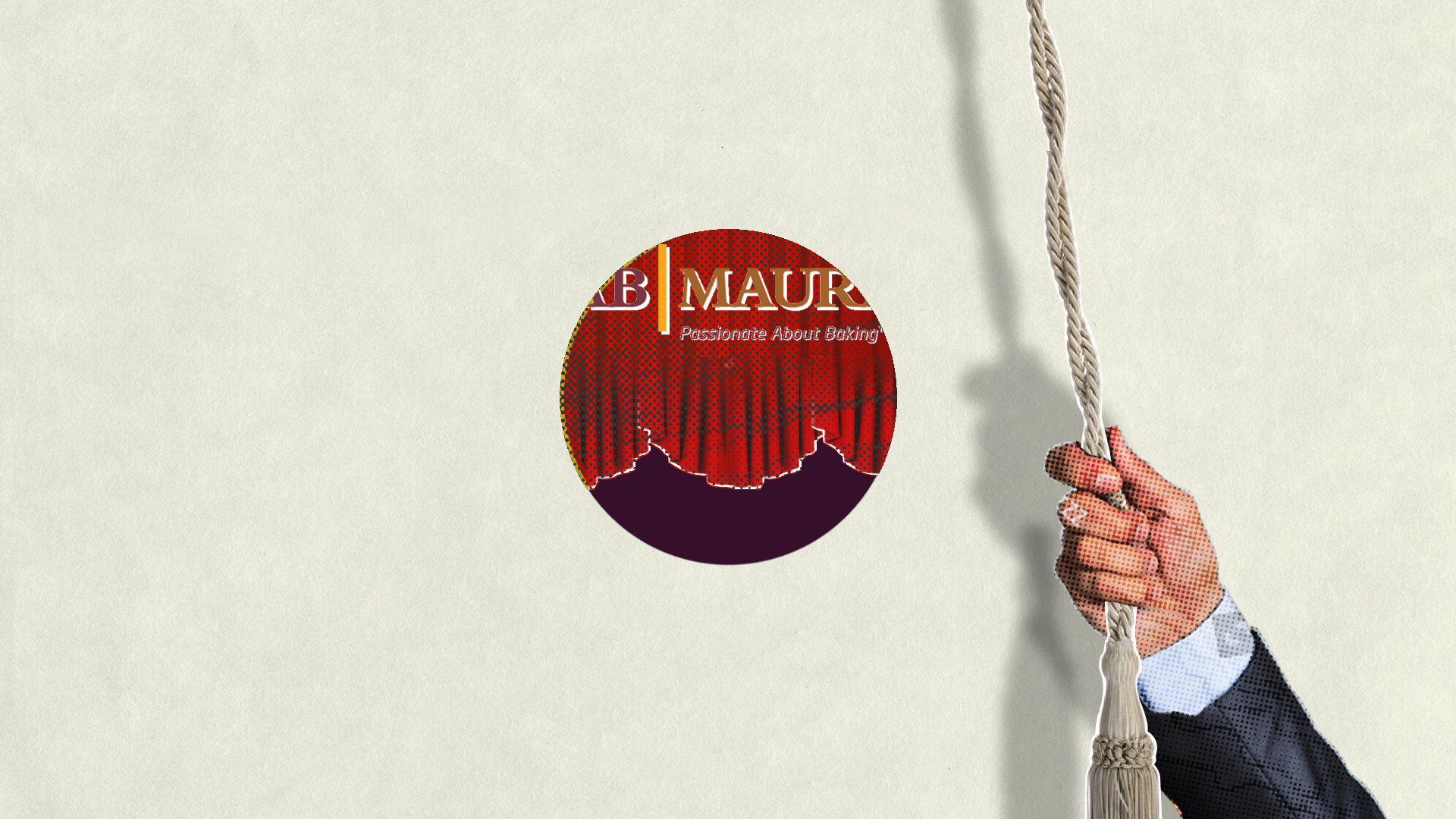
My client, AB Mauri, was introducing Australia’s famous Burgen bread to the United States. They enlisted me to create a video for the launch. The end product was not only an award-winning video featured on AB Mauri’s landing page but also a streamlined process for future content creation.
My role
As the creative director, I was in charge of both designing and executing the content to fit the client requirements. It started with a creative brief, followed by working with a copywriter to tell the story of Burgen bread, leading conception of the look and feel, and finalizing all of the audio and graphical elements for the video.
Client
AB Mauri, North America.
Team
Script: Brian Frazer
Storyboard: Tejal Shah and Gokul Raj
Animation: Gokul Raj and Dasun Jayasinghe
Voice Over: Trudi Nelson
Music: Miriam Mayer
Creative Director: Tejal Shah
Duration
3.5 months
Outcome
Award Winner
We received a prestigious Davey Award for the video, out of 3,000 agencies who entered.
Design System
We created a system that streamlined collaboration and made the process efficient.
Sales Video
This video is featured on the home page of AB Mauri’s website, www.abmna.com
Design Tools
Final Draft
Illustrator
Photoshop
After Effects
Premiere
Cinema 4D
Challenges
Challenges make us re-think our strategies, forcing us to up the game. Here are a few our team faced in this project.
1: Telling a winning story
Creating a video for a product launch is all about storytelling. Which facets of the product do we highlight for the consumer? Getting all stakeholders on the same page about the content is half the battle.
2: Crafting visuals that fit the narrative.
My team had previously worked for AB Mauri, as part of the 150 years celebrations, of Fleischmann’s Yeast. The video was nominated for a Suncoast Regional Emmy and won gold at the Telly Awards the year before. Needless to say, the client wanted similar visuals, but with a modern twist.
Telly Award Winner and Emmy Nominated "150 Years of Flieschmanns".
Fleischmann’s has a rich history of print media advertising. Using artwork from the original print ads in a 2.5d cutout-style animation worked perfectly for the story we were telling, especially for historical content. The challenge with Burgen was finding a way to smoothly marry two seemingly-opposed elements: older, retro visuals with the freshness of the bread, and the lush New Zealand countryside.
3: Process is essential
Content creation is like solving a puzzle. Each part affects the next one. Employing a system key to this project’s success. We devised specific workflows and conventions for everything from file naming to subject lines for emails.
4: Time management
We had a small team and a relatively small budget for the scope of the work, so I was personally involved in the creation of some motion graphic components and visual design. Careful planning, consistent communication with the team as well as the client at every step of the way helped us adhere to the schedule as planned.
Our Process
The first step of the design process involved understanding the client’s requirements and how competitors positioned themselves. Then, we created a moodboard and script. Once that was approved, it was time to create visual elements, like stylesheets and storyboards. We created animatics for complex shots and created the final animation. Once the picture was locked, it was time to record the voiceover, compose music, sound effects, and create the final mix.
Discovery
The client wanted to create a video about 2:30 mins long, about bringing Burgen bread to America. They wanted a much vibrant version of the “150 Years of Fleischmann’s” video we did earlier.
The target market was health-conscious consumers, people who shop at Whole Foods, between the ages of 25 and 60.
Script
Everything in the project must serve the story. For our team, the first step was to review every aspect of the product and list all its essential components, then group elements together to create a story arc.
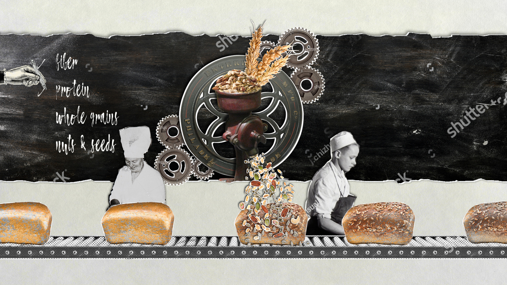
The focus of the piece was becoming apparent. We would talk about the natural ingredients that our customers value. We settled on the theme that Burgen bread is “Positively delicious bread that fits in with your healthy lifestyle.”
Visual Direction
Once the script was locked, we started figuring out the look and feel. We found our inspiration from diverse sources, including web, print, design, and packaging.
Our initial moodboard was broad and included everything from 2.5D graphics and collages to paper cutouts and commercials about other healthy food products.
At this point, we analyzed what other health food companies were doing and how we could set ourselves apart.
A style was taking shape
Organic
We will use earthy and muted tones throughout the video to evoke a healthy & natural feel.
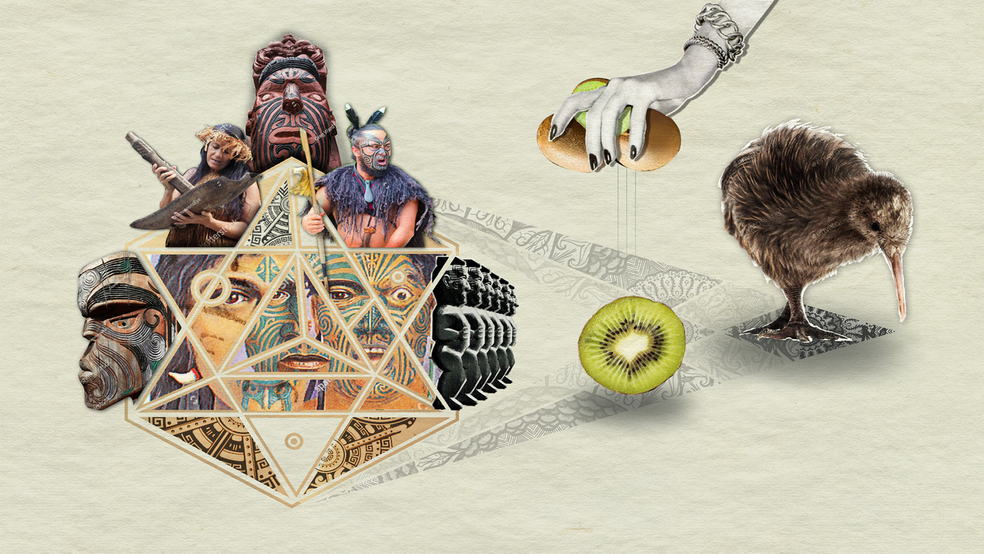
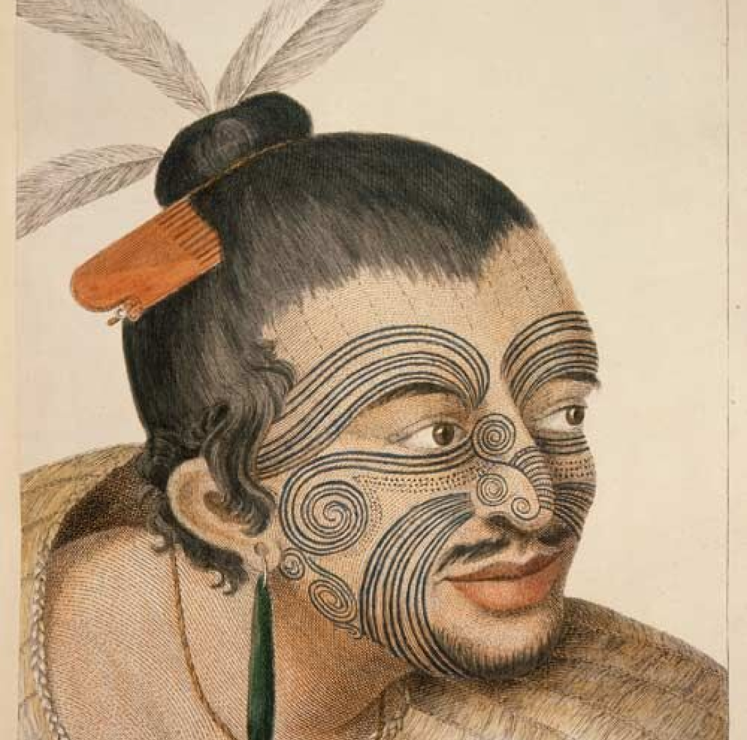
Maori Culture
Take inspiration from the symmetry and geometry in Maori tattoos.
No Additives
Use whitespace and lack of clutter — just like the bread, which is baked only with pure ingredients.
Storyboard
Design is an iterative process. After all, success is 99% perspiration and 1% inspiration.
99% Perspiration
Photographs were going to be a significant portion of the video, and we needed to figure out how to add motion to the photos. We didn’t want to go to the usual puppet tool route. In one of the brainstorming sessions, we discussed unrolling paper like a scroll.
We used stop-motion compositions to achieve this look.
Stop Motion in action.
Composited shot with Stop Motion
Typically, we try out ideas in the storyboard phase, but sometimes that’s not enough. In this case, we knew that the opening of the video had to be perfect, so we created a few animatics before we finalized it.
The Opening Shot
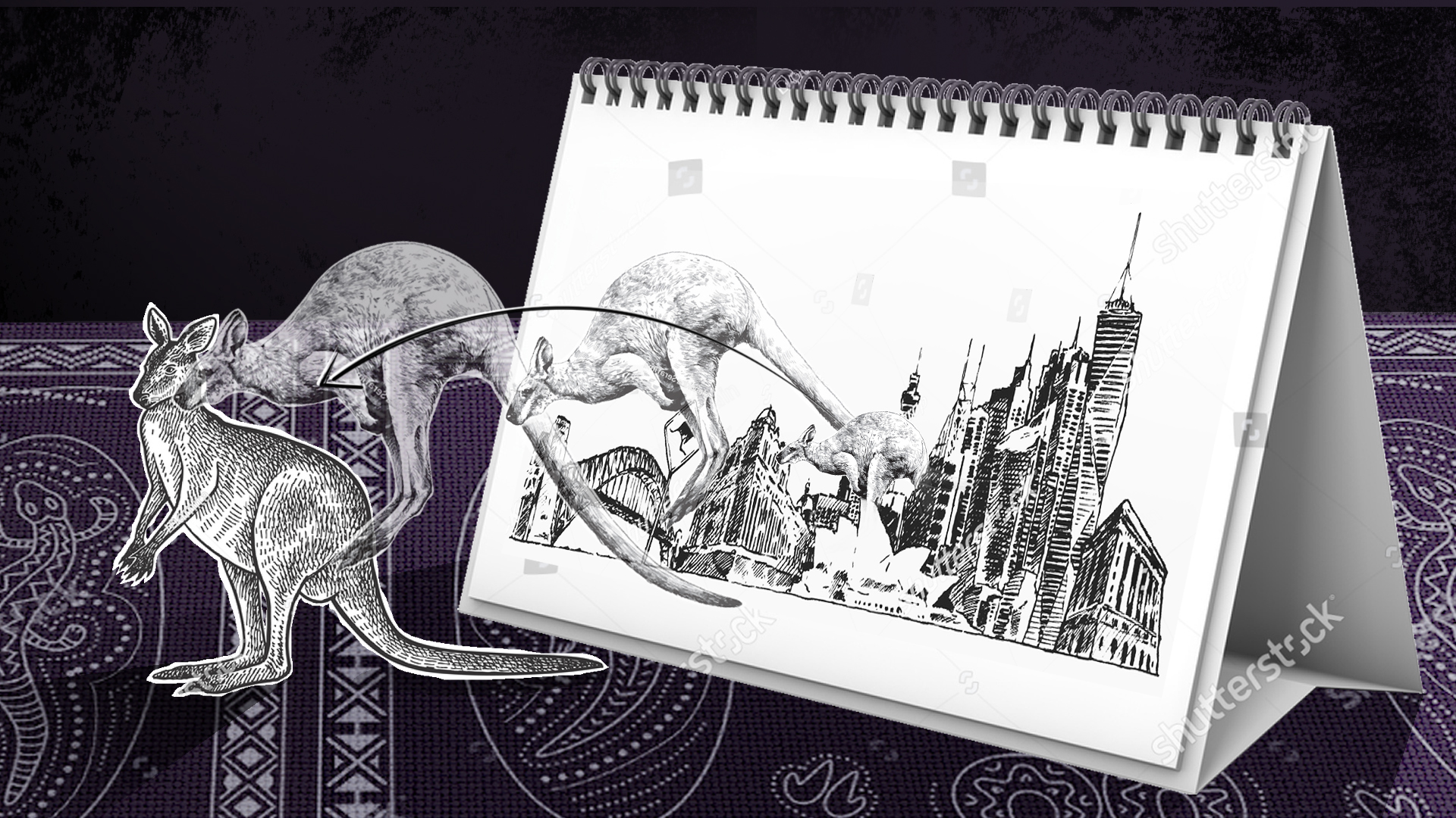
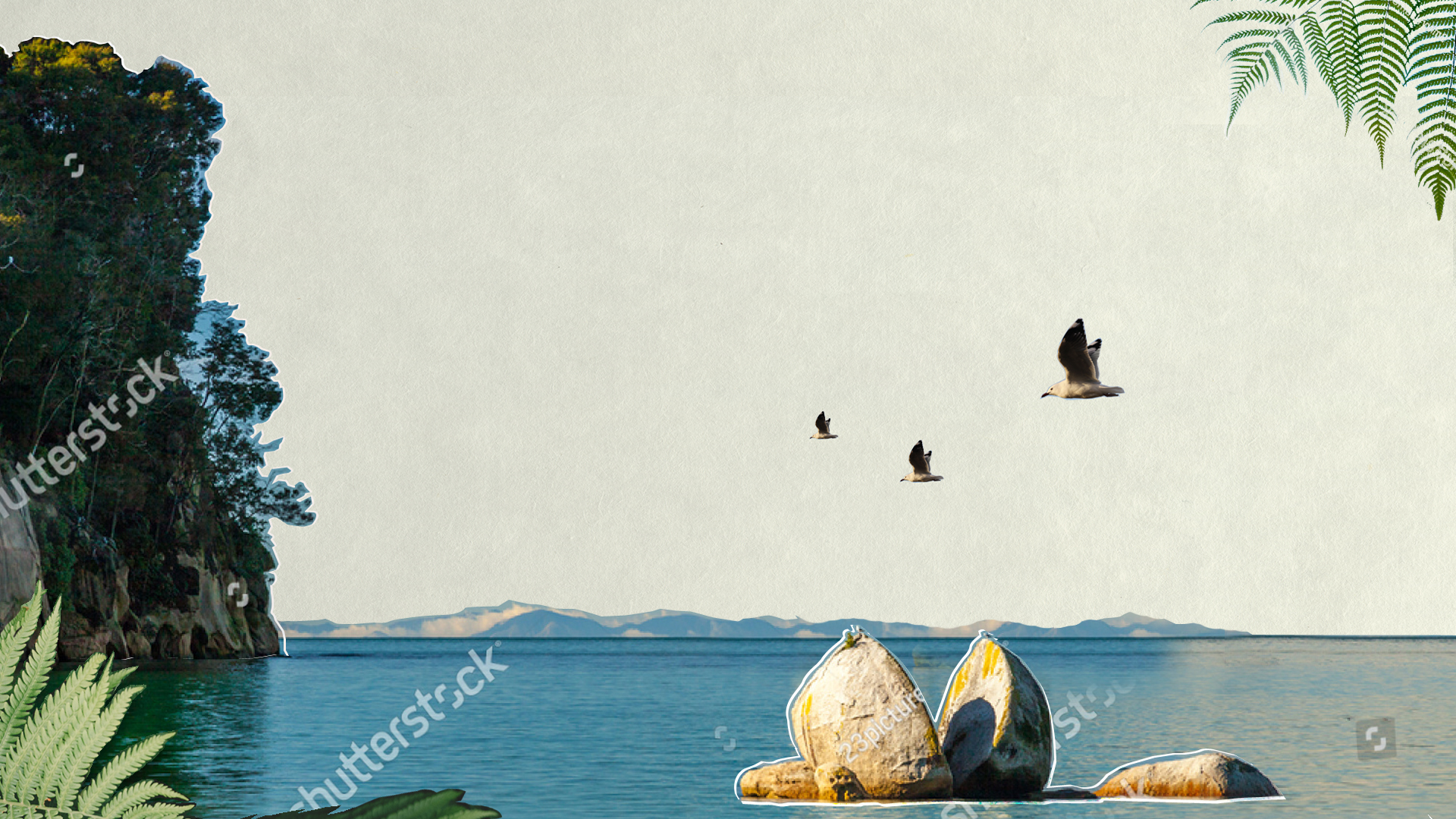
First impressions count. Apart from successfully establishing the tone and rhythm of the entire narrative, the open should also capture the viewer’s interest. Using New Zealand presented our team with a wide variety of choices, from lush greenery to exotic culture. The challenge was introducing it in seconds, without losing the breezy feel of the script.
The Iterations Of the Opening Shot
Version 1
We used patterns from the Maori – the native people of New Zealand. But, it looked too busy and was missing the visual hook.
Version 2
Although the concept of masking the letters worked, it looked cold and blue, when what we needed was warm and green.
Version 3
This version works because of the juxtaposition of lush greenery over a muted, clean background.
1% Inspiration
Sometimes, the smallest tweaks make the biggest impact.
The storyboard worked, but something was missing. The eureka moment came in the form of an image of a Maori Chief by the artist Sydney Parkinson.
"Maori Chief", by Sydney Parkinson
Taking inspiration from his face tattoo, we decided to use dotted lines as connecting elements from frame to frame. That’s it.
Animated tattoo lines on Chief's face
This relatively small change made all the difference!
Rethinking 2D
Sometimes, the best course is to change course. The core idea was to establish bread as a constant through time, and Burgen’s contribution in perfecting the flavors while holding firm to the tradition. Once put on frame properly, the bread slice silhouette formed the background loops nicely.
We began by illustrating the bread and grains, but after rendering it, we realized this approach wouldn’t work. We wanted to highlight Burgen’s use of real ingredients, and an illustration didn’t match that goal. Instead, we chose photo-realistic 3D, which looked more lifelike. We brought in a 3D specialist to complete that shot.
Our first version in 2D
3D render of the bread
3D render of grains
Composited 3D shot
Voiceover
Our client wanted an authentic, New Zealand accent for the voiceover, so we auditioned several U.S.-based voiceover artists. Some of them had even moved to the U.S. from New Zealand, but we struggled to find a perfect fit.
Finally, it dawned on me: Where can I find talent with an authentic New Zealand accent? In New Zealand, of course!
I found an agency from Auckland and worked directly with them on getting the voiceover recorded. With an 18-hour time difference, finding time on everyone’s calendar was another challenge, but the final result was worth it.
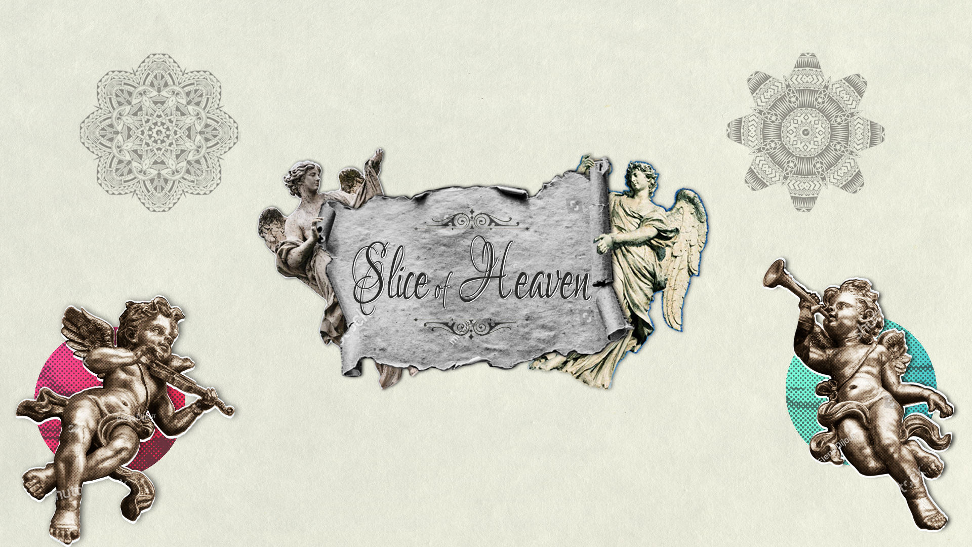
Music
The client wanted to use Dave Dobbyn’s “Slice of Heaven” as our background track. He’s a famous musician from New Zealand, but the price tag was way beyond their budget. Our composer, Miriam Mayer, saved the day. She recorded a track capturing the spirit of that song. And voila! It worked.
"Slice of Heaven" By Dave Dobbyn
Our version composed by Miriam Mayer
Goals Achieved
Our team worked through each challenge along the way to put together an award-winning product.
Goals Achieved
Same, but different
The biggest achievement was creating a video that looks like it can live with Fleischmann’s 150 but also have its own identity and freshness.
Efficient design system
A video like this uses thousands of assets. An efficient system helped everything move swiftly and adapt to quick changes.
A Memorable Impression
This video is central to Burgen’s outreach and campaign efforts. It not only entertains but also educates its customers.
Rick Oleshack
President of Marketing,
A.B. Mauri, North America
”Burgen, a retail bread brand in other parts of the world but a business-to-business baking mix story in the U.S. and Canada, represented new territory for AB Mauri North America. The story – one that started in New Zealand nearly 40 years ago – is both exciting and something you can feel good about from a product standpoint. Studio T Creative has once again captured the background details and created a visually-inspired short film to tell that story, and we’re thrilled about the outcome that includes a prestigious Davey Award for visual excellence.”
We won an award!
Burgen bags a Davey
Davey is sanctioned and judged by the Academy of Interactive and Visual Arts, an invitation-only body consisting of top-tier professionals from a “Who’s Who” of acclaimed media, advertising, and marketing firms.
This year they received more than 3,000 entries. It’s always an honor to be recognized by top professionals in our industry.
We won an award!
Burgen bags a Davey
The Davey is sanctioned and judged by the Academy of Interactive and Visual Arts, an invitation-only body consisting of top-tier professionals from a "Who's Who" of acclaimed media, advertising and marketing firms.
This year they received more than 30,000 entries. It’s always an honor to be recognized by top professionals in our industry.
Key Takeaways
A project with a limited budget, time frame, and a small team is always a learning experience. I am grateful to be a part of it. In the end, we were able to carefully analyze the task, prepare, and create systems to succeed, celebrate the wins, make tweaks where necessary to bounce back from misjudgments, and learn from our mistakes.
1: Collaboration is key
I learned the most valuable thing on any given project is the attitude of the people working on it. We had one motto- let your guard down and check your egos at the door (or – in our case – outside the Skype call!)
2: It's OK to change course
We changed the shot of bread from 2D to photo-realistic 3D. We did this even after the initial approval from the client. We have an excellent relationship with our client and were able to discuss the pros and cons of using photo-real 3D and the impact it would have on the overall piece. Sometimes, you just have to let go of the sunk cost.
3: Process is essential
We learned early on that the only way for the team of our size to manage all the moving parts of a project like this was to develop an efficient, standard workflow for each element, including uniform file names and email subject lines, shared assets, and notes and so on. Without that, things can fall through the cracks, costing time and energy to go back and clean up those small mistakes. If we hadn’t done that, this project would not have been so successful. That’s a lesson I’ll apply to every future project.
Recent work
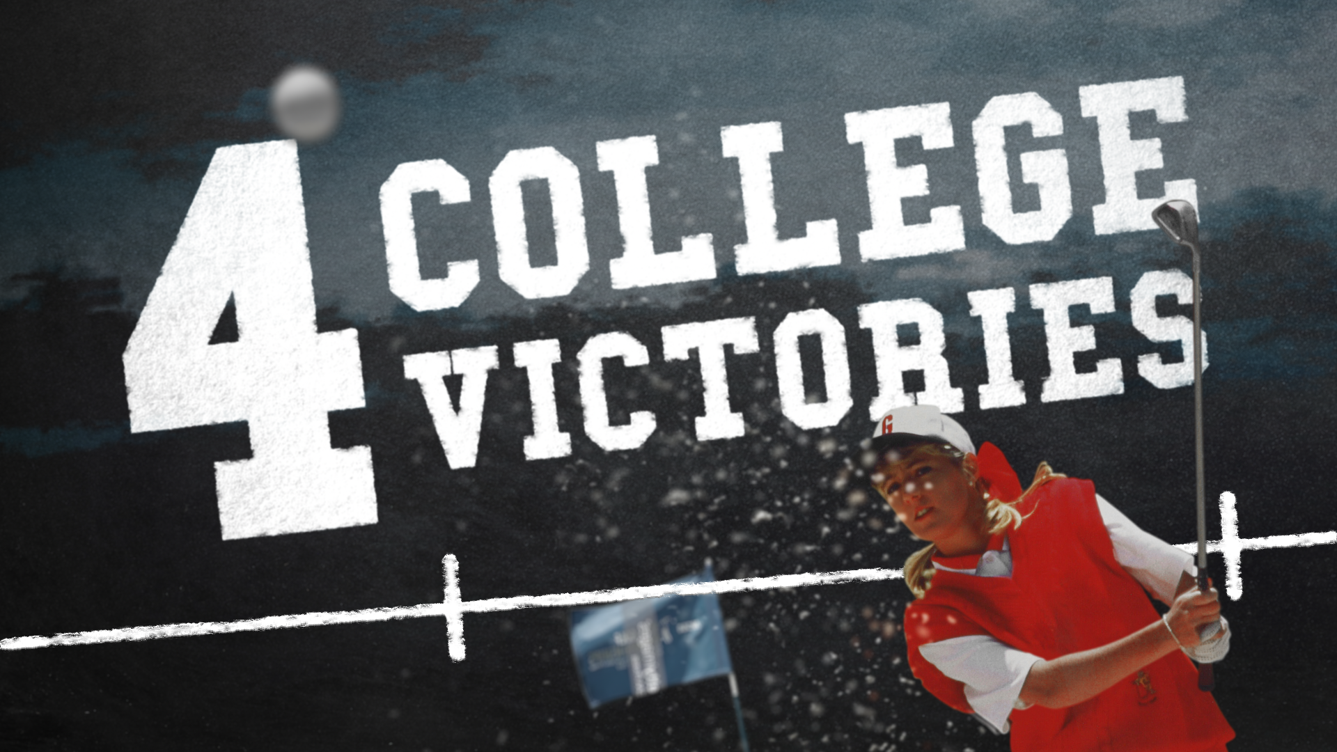
College Golf 101
Motion graphics for a documentary series about the best college golfers in history.
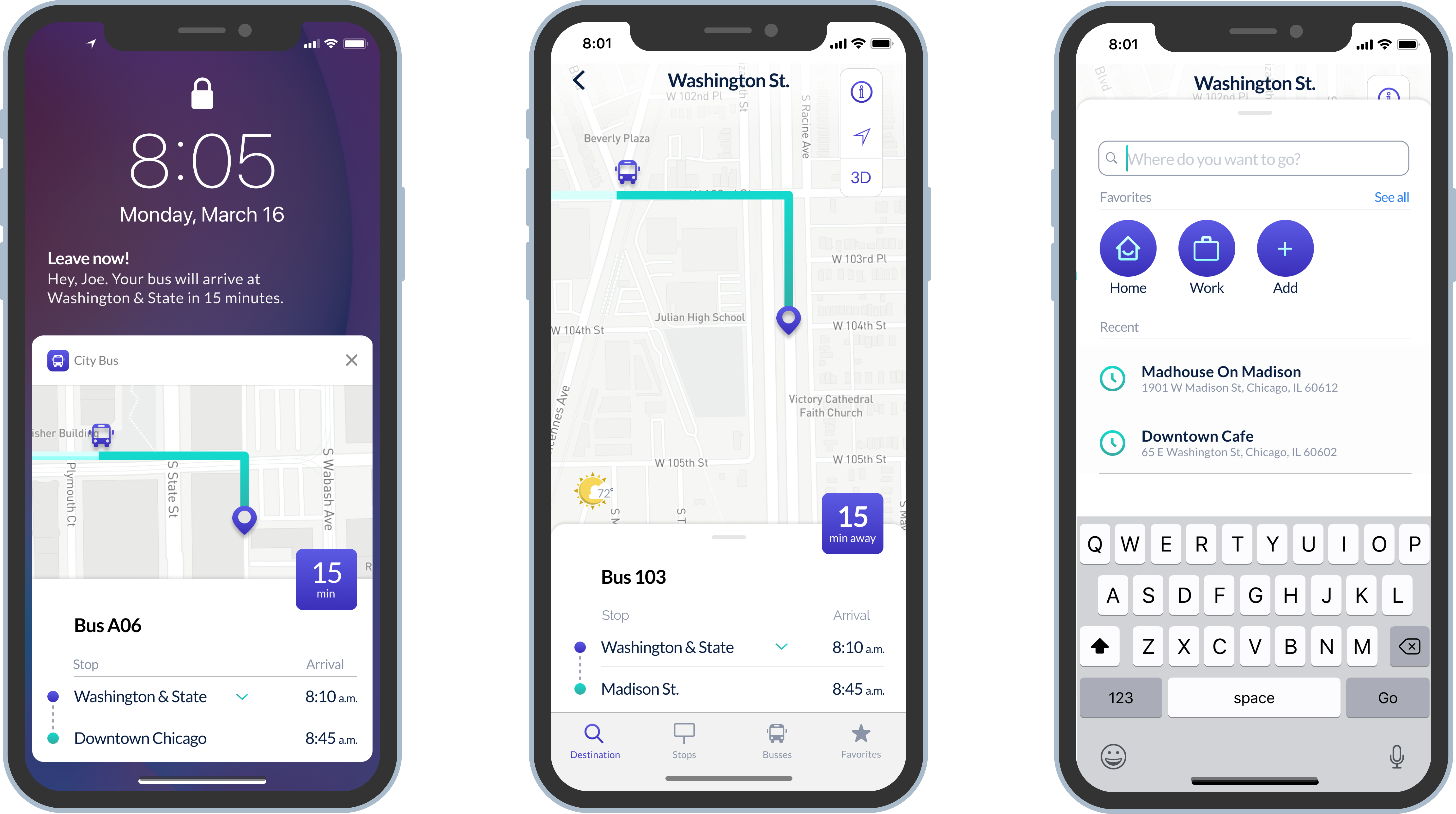
City Bus
Designing a local bus app that tells you when and where your bus is.
Your Friend and Mine
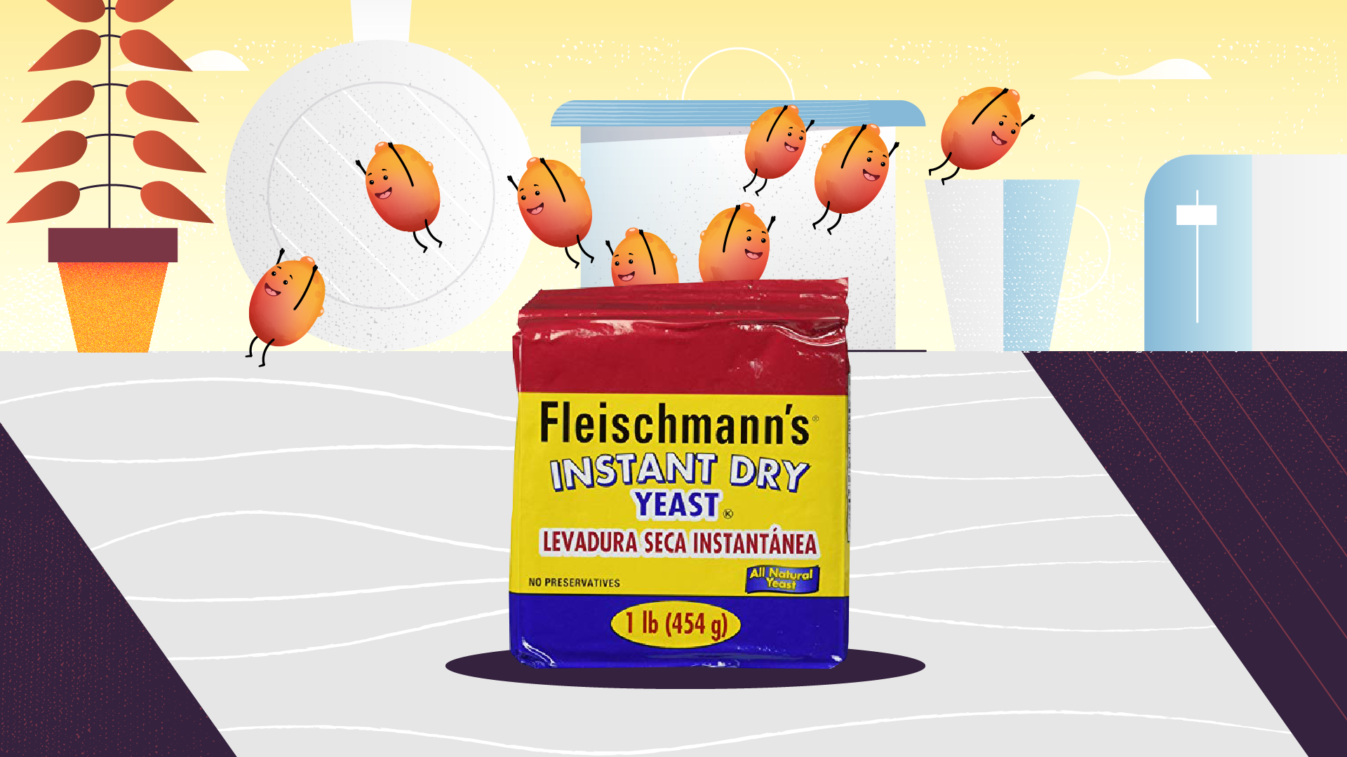
An animated video explaining the key ingredient in the “Fleischmann’s Yeast.”


.svg)