


I collaborated with remote teams, including designers, developers, data scientists, and marketers, to determine product strategy. I was in-charge of designing Home, Search-Result and FAQ pages. My tasks included conducting user research, creating personas, wireframes, high-fidelity mockups, responsive interface design, and prototypes.
By February 2020, COVID-19 is spreading widely across the U.S. W.H.O. has declared it a pandemic, and several countries, including the U.S., are in or entering a lockdown. There are no treatments yet, and the vaccine will take at least 18 months to become available — that is, if everything goes right.
All experts agree the best way fight the virus to test as much as possible. In the U.S., the procedures and requirements for each testing center differed and varied across States. There is no central directory for testing locations and requirements.
UX Designers: Tejal Shah, Lindsay George
2.5 months
Imagine you are sick and suspect that it might be COVID-19. How do you find the best testing center around you? What are the basic requirements to get tested in your area? Do you need insurance? Do you have to pay for it? Do you have to walk in a treatment center, risk getting infected, or can you get tested from your car's safety?
Get Tested COVID-19 is a database of testing centers across the nation. Just punch in your zip-code and see test centers in a list form as well as on a map. It also provides key information like distance, appointments required, pre-screening required, etc. You can filter by the type of location, in-facility or drive through. The new updates will include turnaround time and cost.

Challenges make us re-think our strategies, forcing us to elevate our game. Here are a few our team faced in this project.
Time was of the essence. We wanted to be up and running as soon as possible. I was the first designer on the team. By the time I joined, the site was live — it needed a lot of work as they were using a bootstrap template. However, re-coding everything from scratch wasn't an option at the moment. So my first goal was to work within the parameters of that template. Make the information accessible and understandable with minimal changes.
We were working remotely with over 30 volunteers from around the world. Coordinating everyone to be on the same page in different time zones was a challenge — that ultimately led to a very fulfilling experience.

The goal of my assessment was to understand user pain points and figure out solutions to eliminate these problems. I noticed a few discrepancies in the design that could be resolved easily.
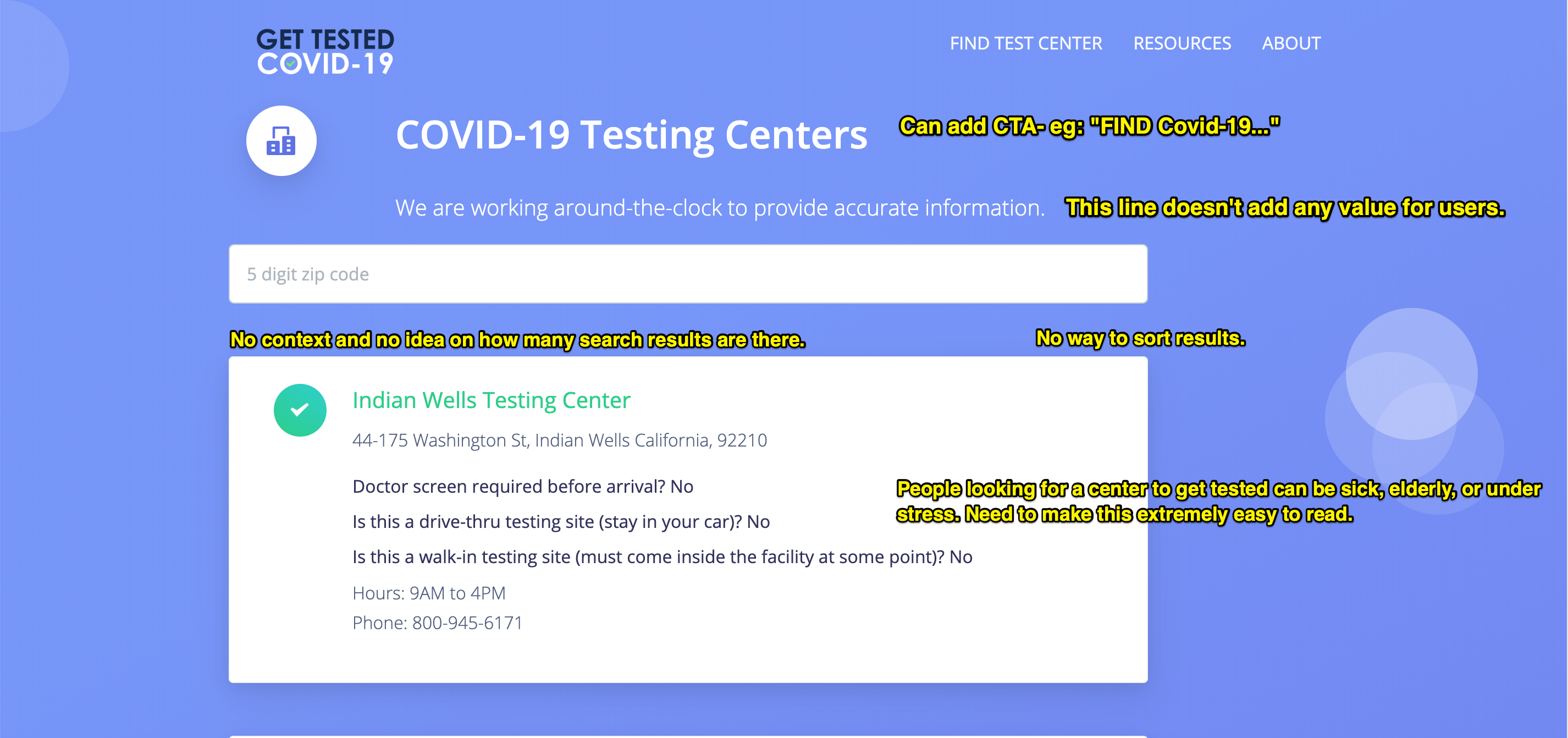

We had a google spreadsheet with a lot of information about each testing center. To determine exactly what to display in search results, I created a user survey. A few things that jumped out right away.
Our users largely fall under the following broad groups.
The Curious Bunch they don't have any symptoms but want to keep an eye and know what's going on in regards to COVID-19 testings.
Do I have COVID? These are the people with symptoms and need to get tested. Their needs are more immediate, and they're also in a stressful state of mind. This group is further divided into two sub-groups.
Loved One: A friend or a relative of the person with symptoms. Most of these are younger and more tech-savvy individuals looking up information for their loved ones.

Most survey takers asked to include contact information, and qualifiers, like doctor’s screening or appointments.

A majority of survey takers would like to be able to see the distance and directions to the testing centers.

A number of survey takers thought that the ability to share search results was essential.
Based on the survey, I created two User Personas to gain perspective, and empathize with the end users.
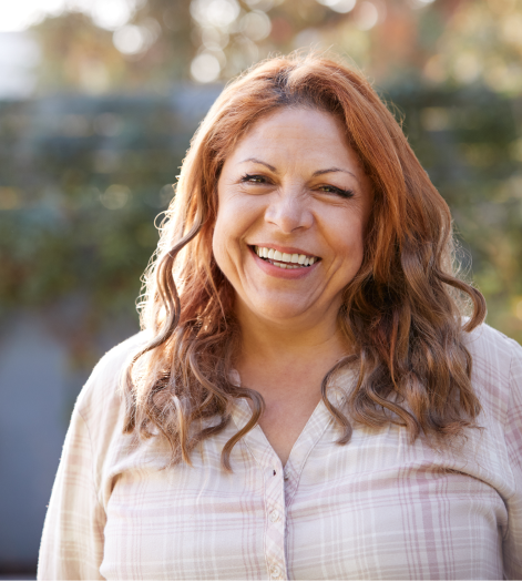

67, Edison, NJ
Maid
67, Edison, NJ
Maid
To find a way to get tested for COVID-19.
Martha, 60, a maid from N.J. lives alone after her husband passed away three years ago. Her only daughter is in Los Angeles. She spends her quarantine time reading forwarded Whatsapp messages and watching Fox news.
She has been feeling sick. She has recently found out that one of her employers has COVID-19. She needs to get tested. She is uninsured, so she is trying to find a location that will not charge her for the test.
The city has information on its website, but Martha isn’t web-savvy. Where can she go to the closest testing center?
Many testing centers ask you to get more information from your doctor’s office. Martha doesn’t have insurance and no family physician she could call.
“I am tired, sick, and worried. I wish finding all the information needed was easier than this.”




41, Westwood, CA
Teacher
41, Westwood, CA
Teacher
To find all information, in case he needs to get tested for COVID-19.
Cameron is a cancer survivor. His immunity is compromised, so he always likes to stay up-to-date with all information he would need in case of an emergency.
As a teacher, he's busy moving his entire curriculum online so the students can continue making progress. He spends the rest of his quarantine time on Facebook, Tweeter, and CNN.com.
Life has suddenly got busier. There is no way he has the time to go through various sites to find all information he would need in case of an emergency.
Google results show insufficient information. He still can’t find out things like cost and turnaround time for test results.
“I just can’t believe that this entire process is so inefficient!”




COVID-19 is spreading like wildfire. So, in this case, getting the first update live as soon as possible is crucial. My goal is to change as little as possible from the current template. The most critical factor is the card design for search results. If I get that right, the user experience will be significantly improved.
I started figuring out the best way to showcase the required information.

Over 50% of the survey takers thought adding a map was important. However, we wondered if people will scroll down to see the results or get confused about the placement of results.

A card design allowed us to add a map on the side. It lets people view the results in the format they prefer.

In the interest of time, we ditched the home page. Instead, scrolled to search results when someone typed in a zip-code. I added an illustration so it looks like a landing page.
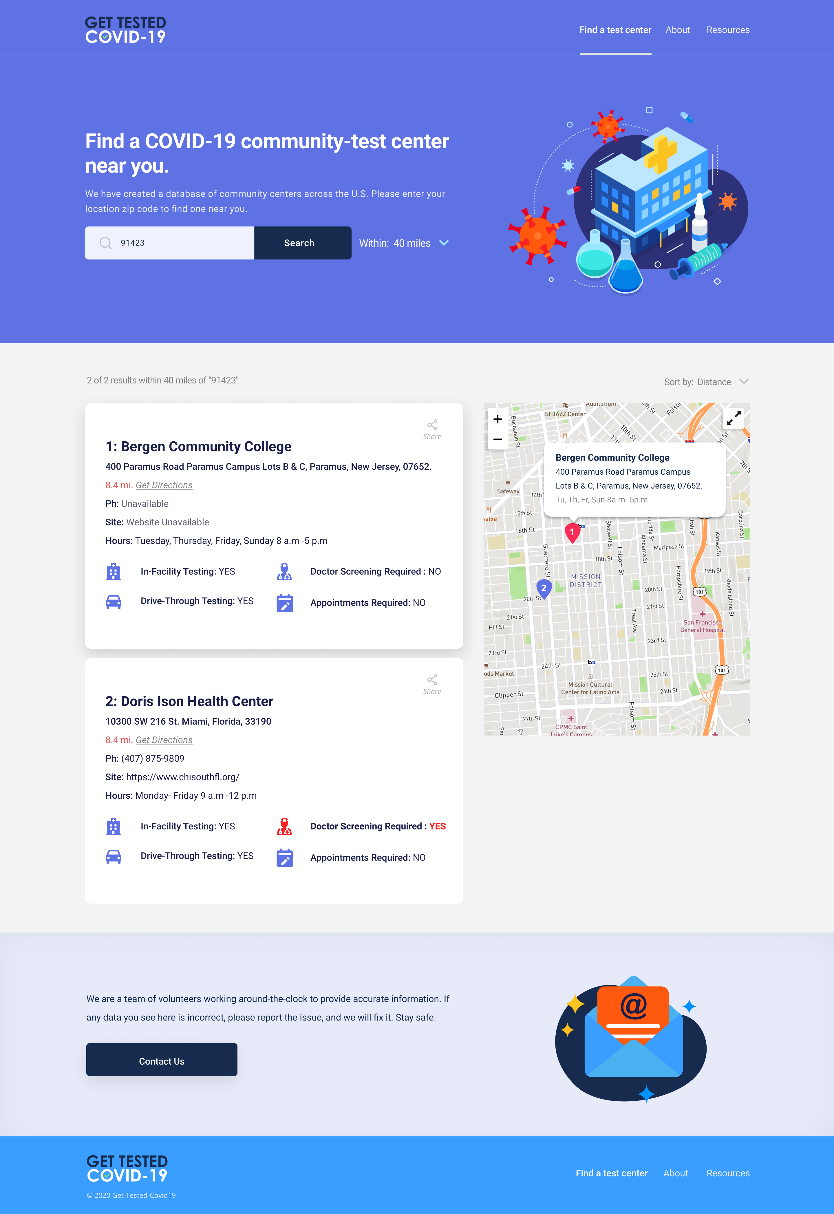

As our database grows, so do our insights. We've even begun eye-tracking with Crazy Egg to understand how the users were navigating through the site. We synthesized our observations to the following:
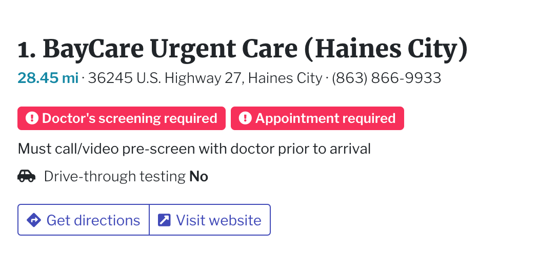
Many centers provide specific information that was unique to the center, so it is necessary to display it in its entirety.
All centers are in-facility centers, and a few of them have drive-through available OR are just drive-through pop up centers. So, the differentiator is drive-through. We do not need to display in-facility testing as a feature.
Crazy Egg recordings show the bounce rate after punching in the zip-code is high. We suspect that even though we scroll to the search-results, we need to give better feedback to the users. We need to separate the landing page and the search results page.
The testing centers in our database is growing, so it is essential to add pagination.
Even with the amount of data we were scraping, we needed people to suggest centers that we missed. So the process of recommending a center or pointing out an error in our database has to be prominent.
We were also planning to add more information like how long does a test center takes to process your results? Do they do antibody testing? Do they charge for the test? Etc. We need to add sort and filter options, so people find it easy to search for things that they're looking for.

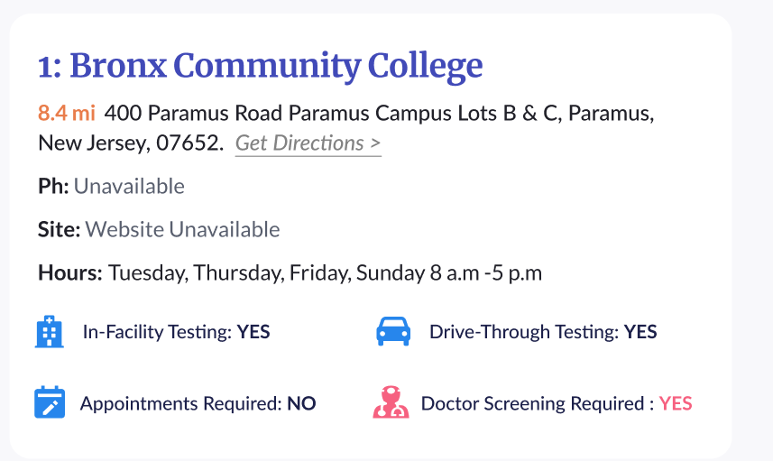
Our lead designer, Jono Lee created the updated IA based on new data and insights. We started by updating the card design.
All icons were laid out side by side.
The most important information is on the top and color coded. This also helps separate features and qualifiers.

I collaborated with the marketing team to update the branding. Together, we figured out our brand values.
GET TESTED COVID-19 makes me feel like I'm being cared for. It gives me a way to find what I need efficiently. I trust the results
Now that we know what our brand feels like, it was time to implement it visually. By this time, we had already started outreach efforts with the original branding. So our goal was to tweak as little as possible to make a significant impact.

The updated palette included a slightly darker hue of purple. The darker color added more contrast- thus, increasing accessibility.
We added a combination of Serif and San Serif fonts for a better hierarchy.


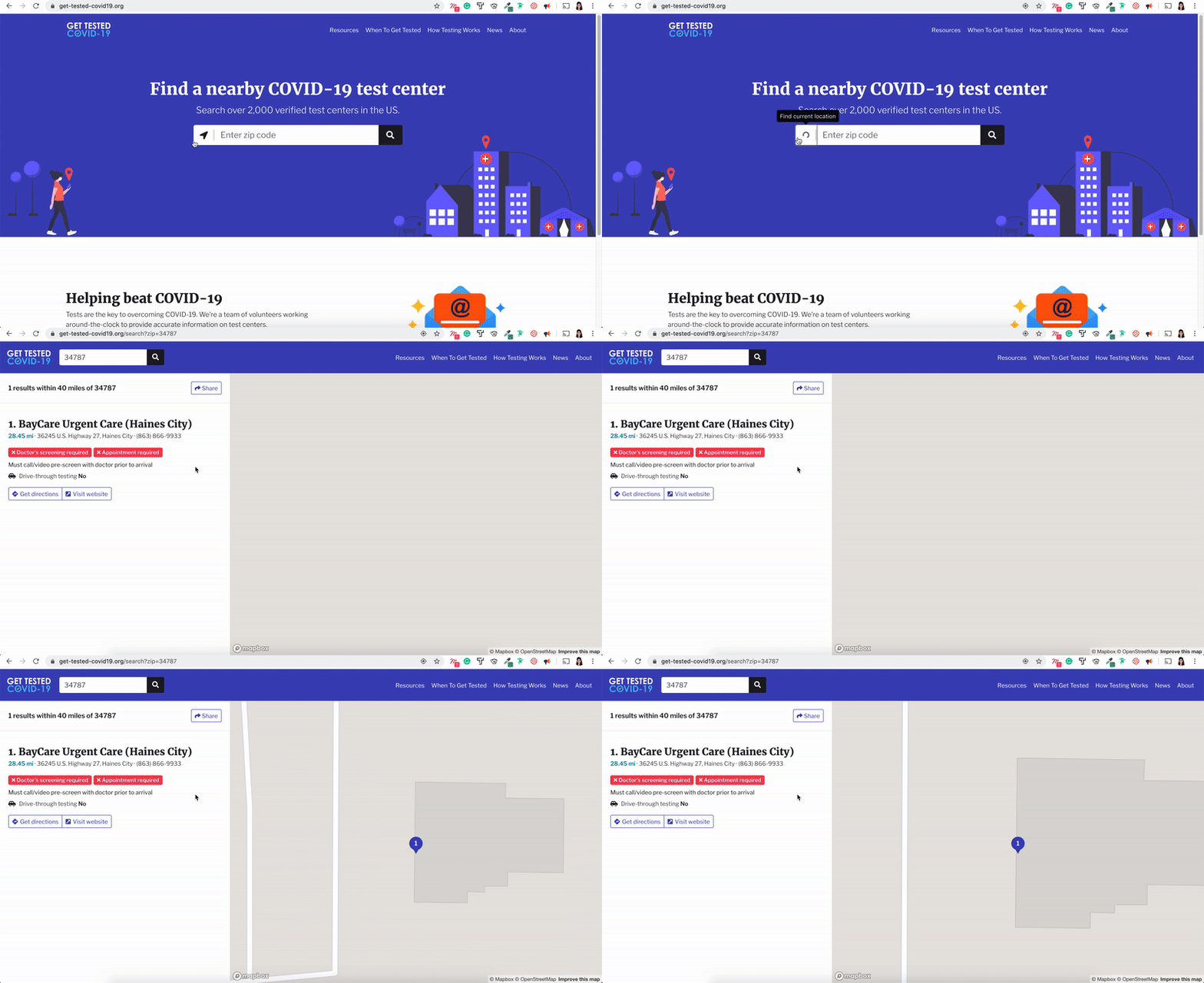
.gif)

The most important lessons I learned are as follows:
When it comes to Get Tested- the time was of the essence. Getting the first version out that fit within the boundaries of the existing template was a challenge. It taught me how to design within the constraints of an existing bootstrap template.
Over 30 people from around the world helped out at different stages. A majority of our choices on this project were dictated based on what we can develop at that particular time.
As we get more data, patterns start to emerge, and priorities began to shift. Things that didn’t seem important in the beginning start to dominate the decision making. For example, based on the data that we had early on, we didn’t need to publish the paragraph info posted on each center’s site, as it was redundant. However, as we received more data, we learned that some centers are providing unique information, not listed anywhere else. So we redesigned to include it.
This was a fast moving project, so a rigid process framework would have been detriment to our progress. Therefore, maintaining flexibility while committing continuing research and following design principles was a key to the continuous improvement of the project.