


The process of designing a bus-tracking app for commuters.
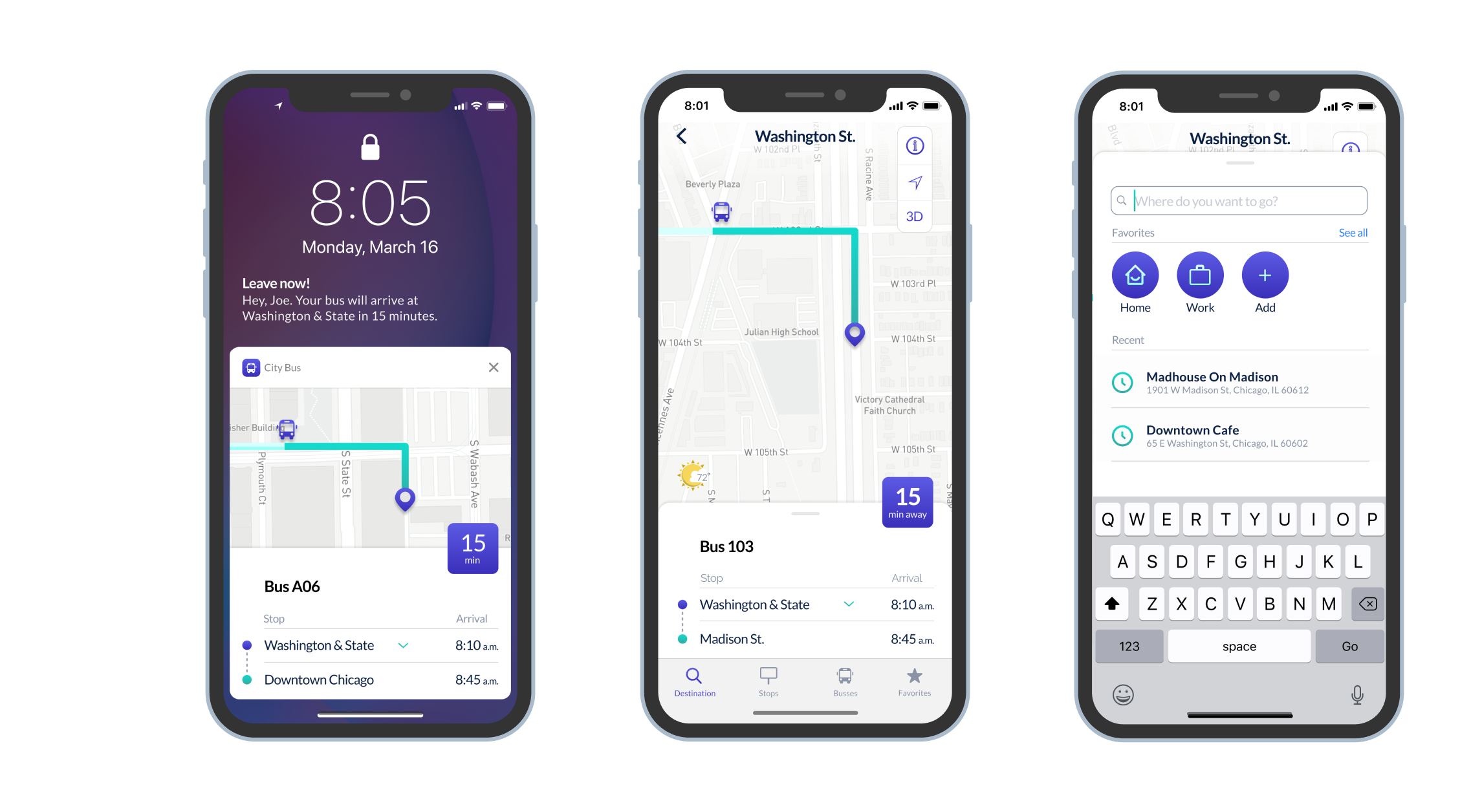
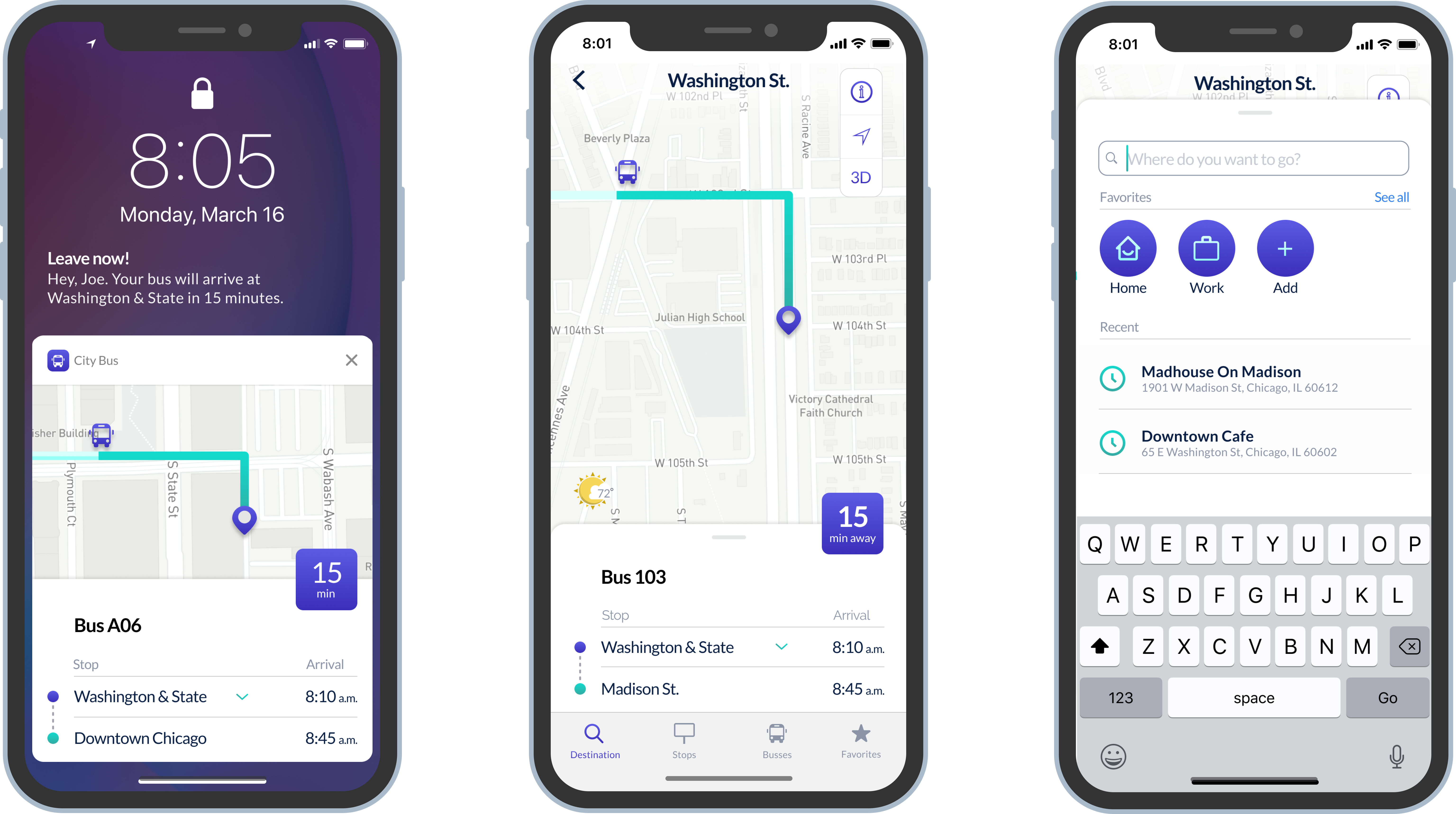
I led the ideation, strategy and design for the mobile application.
2 weeks
Research
User Flows
Information Architecture
Sketching
Wireframing
Branding
Content Strategy
Interface Design
Prototyping

Duration: 2 weeks
I was tasked with helping create a mobile app called City Bus, an application operated by the local city transit system that serves thousands of commuters in a large city.
Transit officials have identified a problem they would like to solve. Due to expansion, numerous bus routes have been recently added, and many of those routes stop at the same bus stop. Riders want to know what the next arriving bus is and how much time they have to get to the bus stop. Merely rushing to the stop when you see a bus coming no longer works because it might not be the bus the rider is expecting.
I created an app that would make commuting a lot easier because you know exactly when your bus is arriving.
City Bus lets you-

The first step of the design process involved understanding the requirements and how competitors positioned themselves. The path to Idea Board consisted of detailed and careful user research, competitive analysis, user personas, user stories/flows, wireframes, mockups, branding, prototypes, and user testing – all with various iterations.


Nineteen participants took the online survey. My goal was to understand patterns, trends, and outliers.

Take the same bus every day. So knowing when the bus will arrive is more important than figuring out which bus to take. Delay notifications are beneficial.

A majority of the passengers are engaged in reading, chatting, or watching something while commuting. Getting offboarding notification will be helpful.

Most users would like to know which bus is coming next because people often run for a bus only to find out it's not their bus.
While many commuting apps from local to national and international, there are currently a few other main competitors with City Bus: Citymapper, Moovit, Google Maps, Transit, and Transit Stop.
City Bus is a local application. So our most significant opportunity is to focus on the commuters. Lose the clutter of the larger navigational apps, and focus on the features that assist with the daily travel.
Next, I created the low-fidelity wireframes. I performed three user-tests. Two online and one in person.
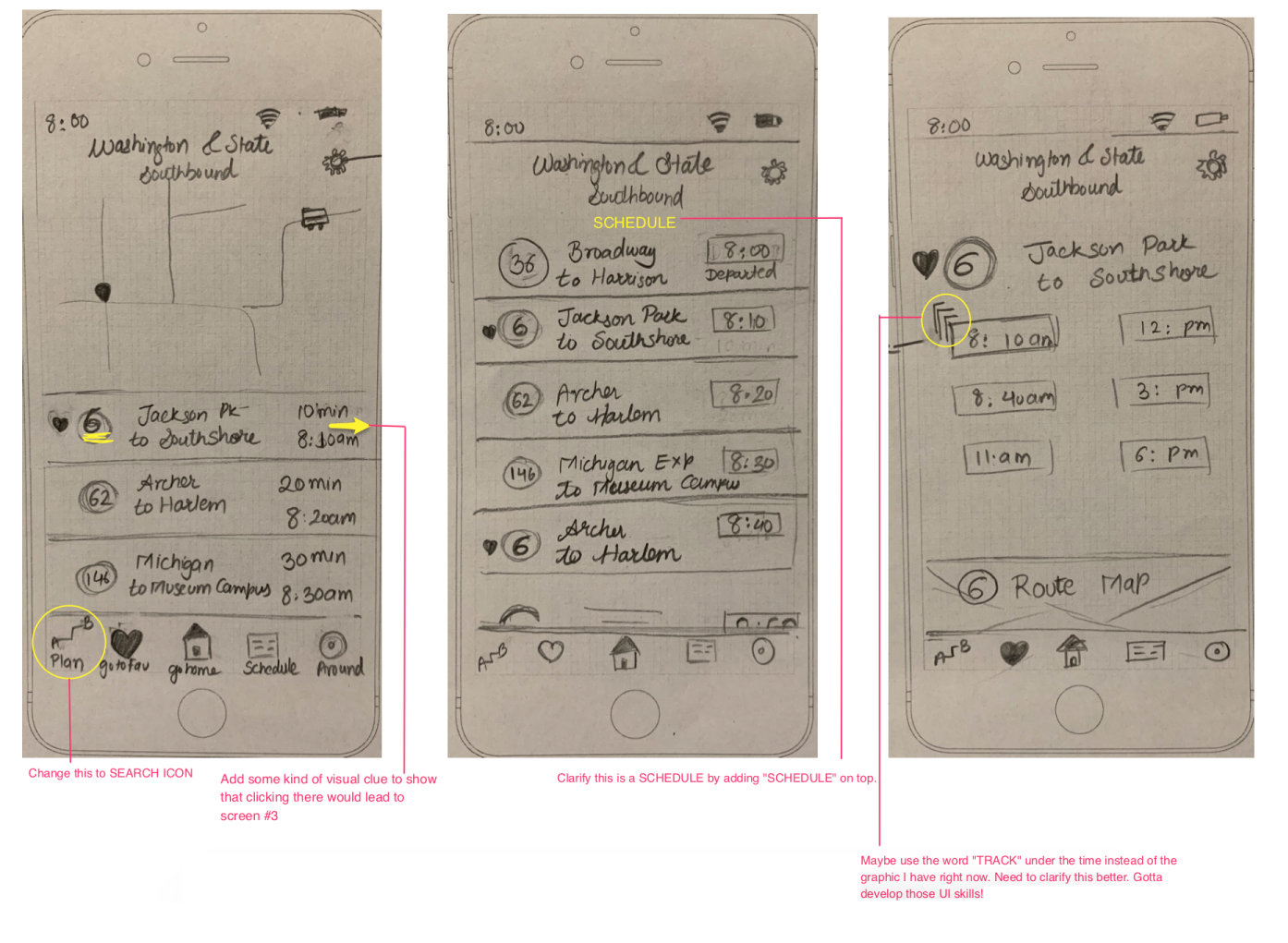
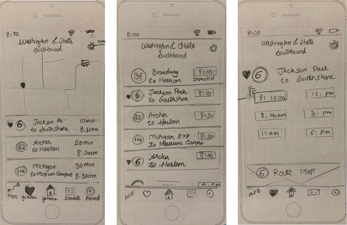

I used the data collected from the user tests to tweak the design. I updated the sketches for larger phone screens.
Colors and fonts were selected, keeping legibility and accessibility in mind. People are using this application while they're on the go — so they must be able to access all features with ease.
Checkout my clickable prototype:
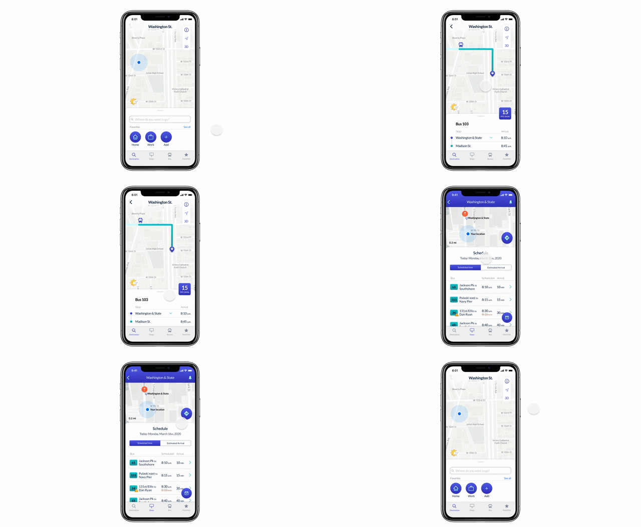
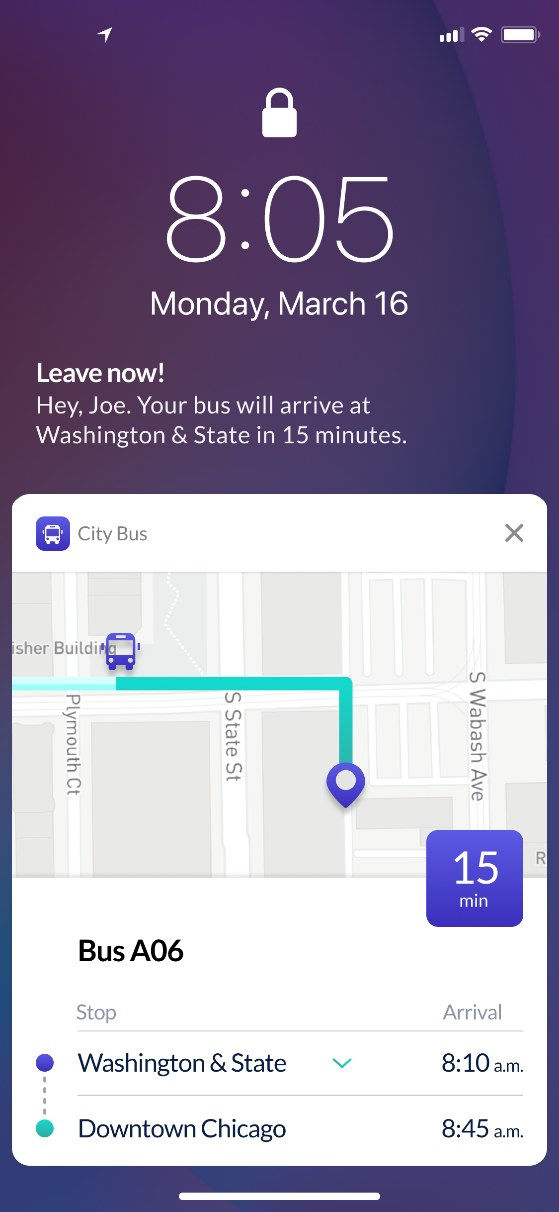
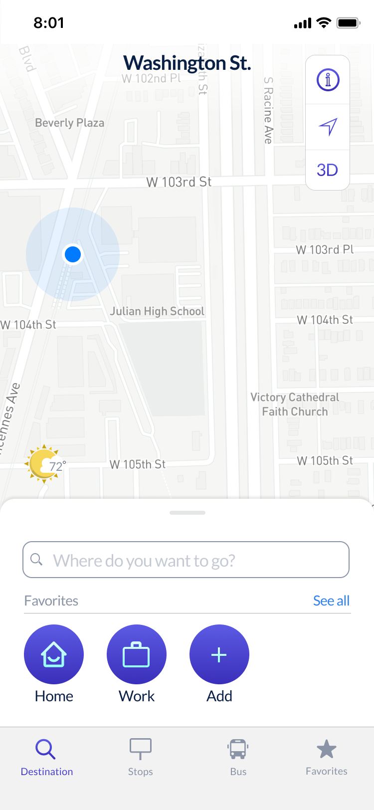
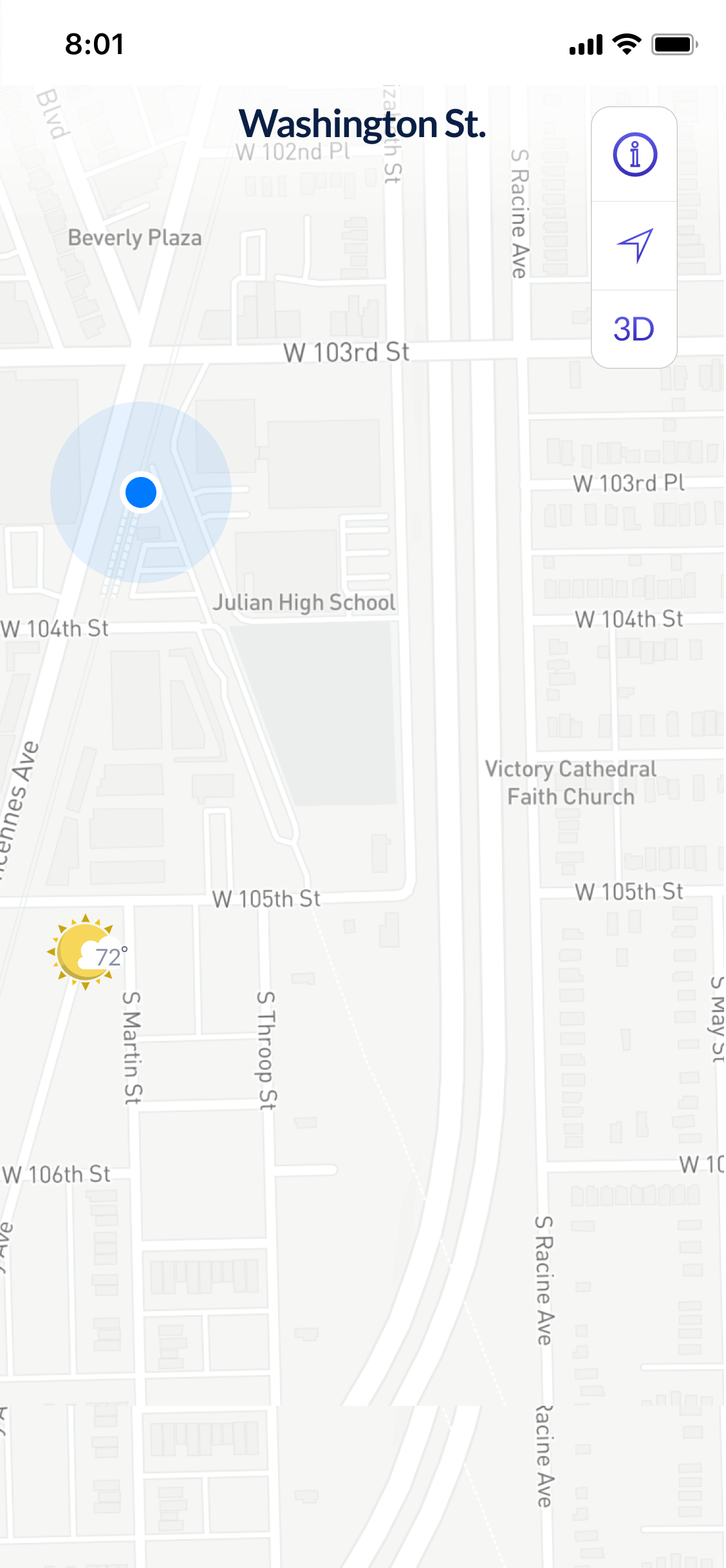
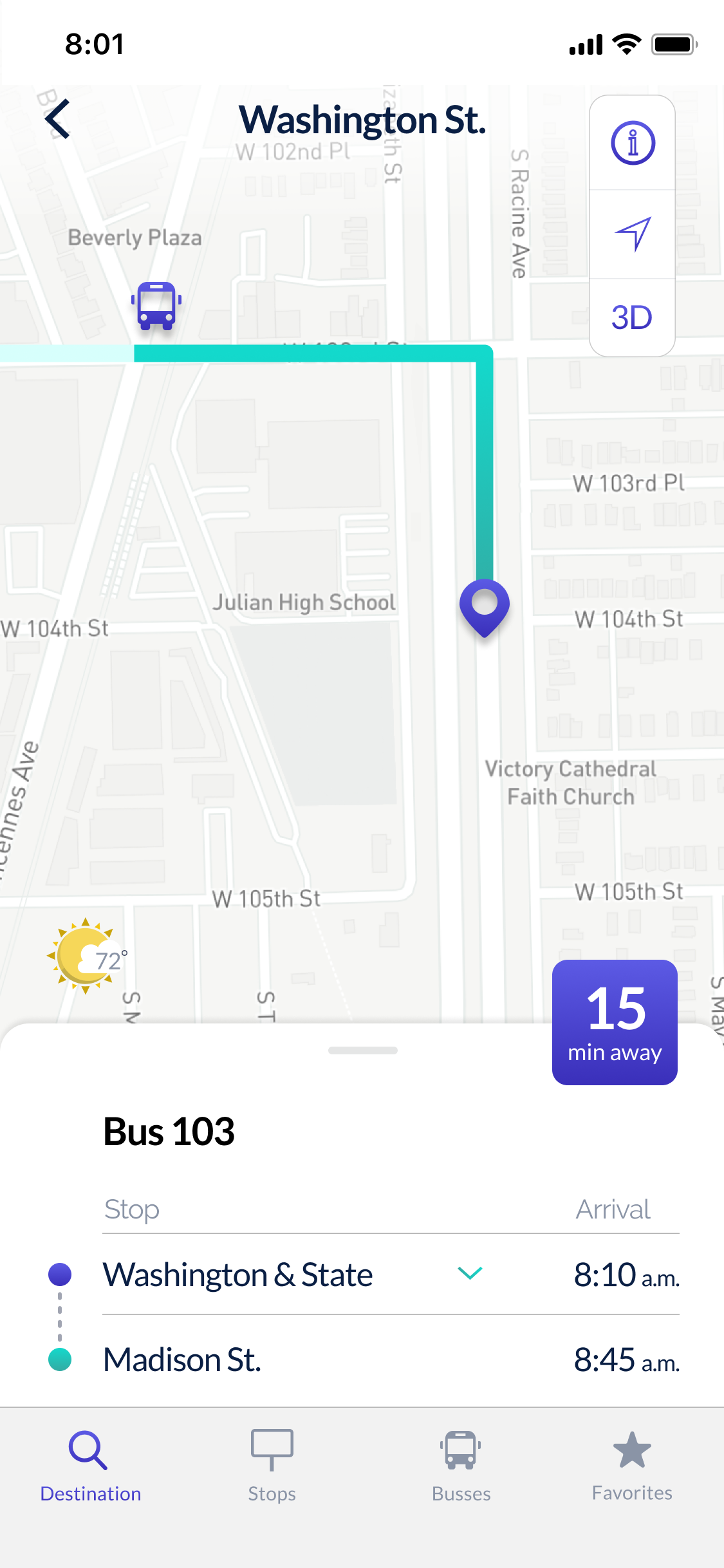
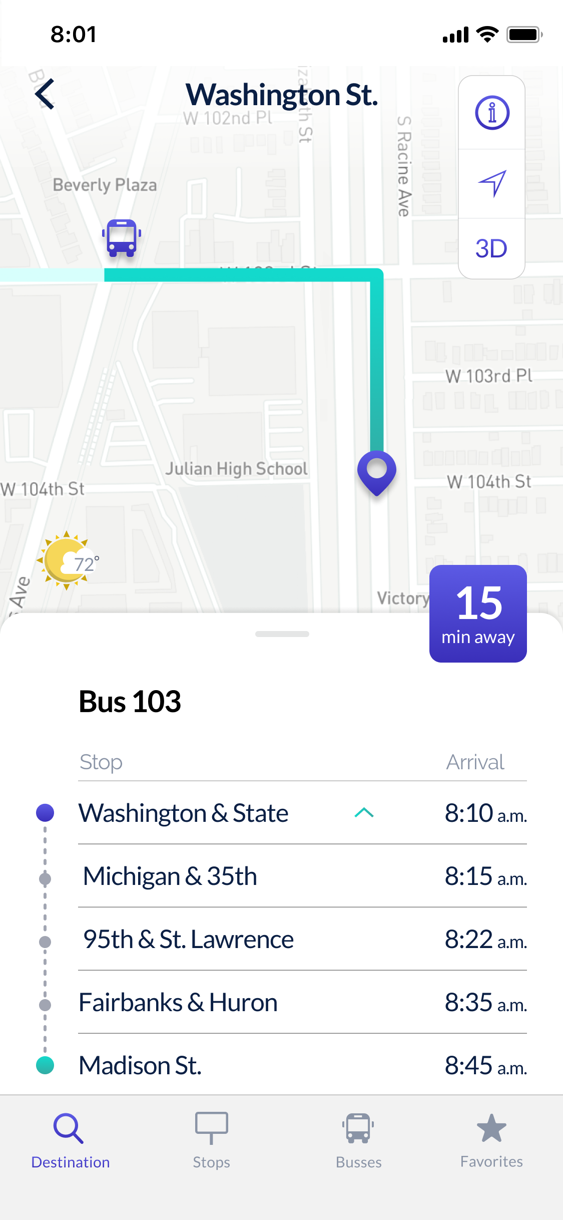
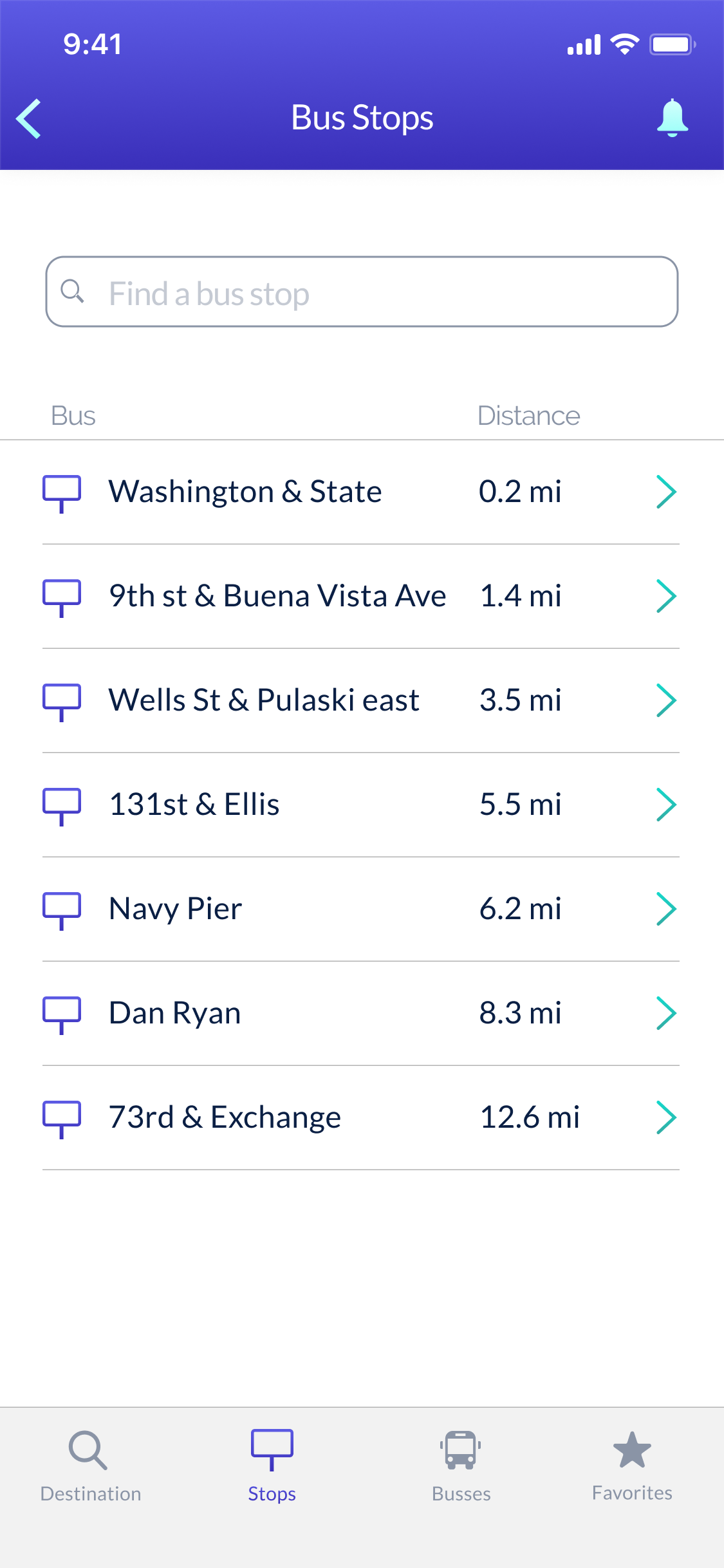
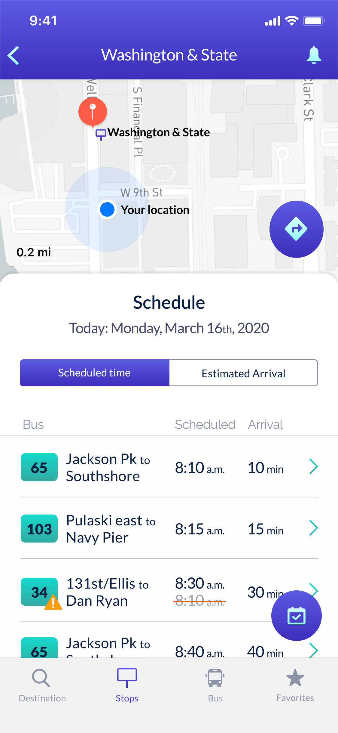
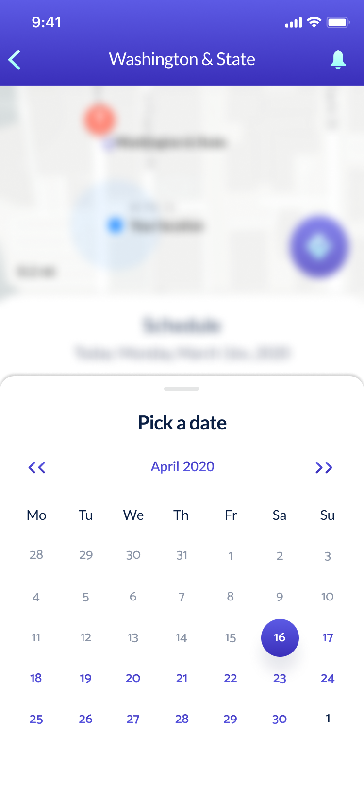

The success of this design comes from the understanding that we don't need all the features provided by larger apps, like Google Maps,Citymapper, etc.
As new devices flood the market- it is essential to keep up with it. Otherwise, the product will look dated and out of touch.